What is Accessibility in Website Design?
Accessibility, or a11y for short, is all about making sure your website is a welcoming and inclusive space for everyone, regardless of their abilities. At its core, accessible web design ensures that people with disabilities, such as visual, auditory, cognitive, or motor impairments, can perceive, understand, navigate, and interact with your website without any hiccups.
Why is Accessibility Important?
Aside from being the right thing to do (because inclusivity is always in style), making your website accessible has some serious perks:
- Better User Experience: An accessible website is typically more user-friendly for everyone, not just those with disabilities.
- Legal Compliance: Many countries have laws and guidelines to ensure web accessibility. Being compliant can prevent potential litigation.
- Wider Audience Reach: By catering to people with disabilities, you’re opening up your website to a larger audience. More visitors = more potential customers, fans, or followers. It’s a win-win!
- Improved SEO: Search engines love accessible websites because they’re easier to crawl and understand. Accessible websites can be read, categorized, and synthesized by machines; making your site accessible increases your site scores and page rankings.
Key Accessibility Features
So, what makes a website truly accessible? Here are some essential features to keep in mind:
- Keyboard Navigation: Ensure that all content and functionality can be accessed and operated using just a keyboard. (Put your mouse away and try navigating your site).
- Alternative Text: Provide descriptive alt text for images, so screen readers can convey the information to visually impaired users. Ensure your alt text conveys both the description and key messages being supported by an image.
- Appropriate Tap Targets: Have you ever tapped one button on your phone, only to accidentally hit the neighboring one instead? This happens when tap targets (links) are too small for our fingers to reliably select the intended target. Tap targets that are too small can lead to accidental taps on the wrong buttons or links, frustrating users. To prevent this, design tap targets that provide an appropriate amount of space for fingers to accurately tap the intended target without overlapping neighboring elements.
- Closed Captions and Transcripts: For multimedia content, include closed captions and transcripts to make it accessible to those with hearing impairments or in situations where audio isn’t an option. Most people scroll without sound; closed captions allow you to communicate a message without audio.Did you know? Many polls show that younger generations are using closed captioning more than ever before. Over half of Millenial and Gen Z users report using closed captions even when they have no hearing impairments.
- Proper Heading Structure: Use proper heading tags (H1, H2, H3, etc.) to create a logical outline and hierarchy for your content. It’s like having a well-organized table of contents for your website. Consistency is key. Each page should have only one H1 heading, with subsequent headings in numerical order. (Don’t skip H2 because you like the look of H3 better; doing so confuses machine readers.)
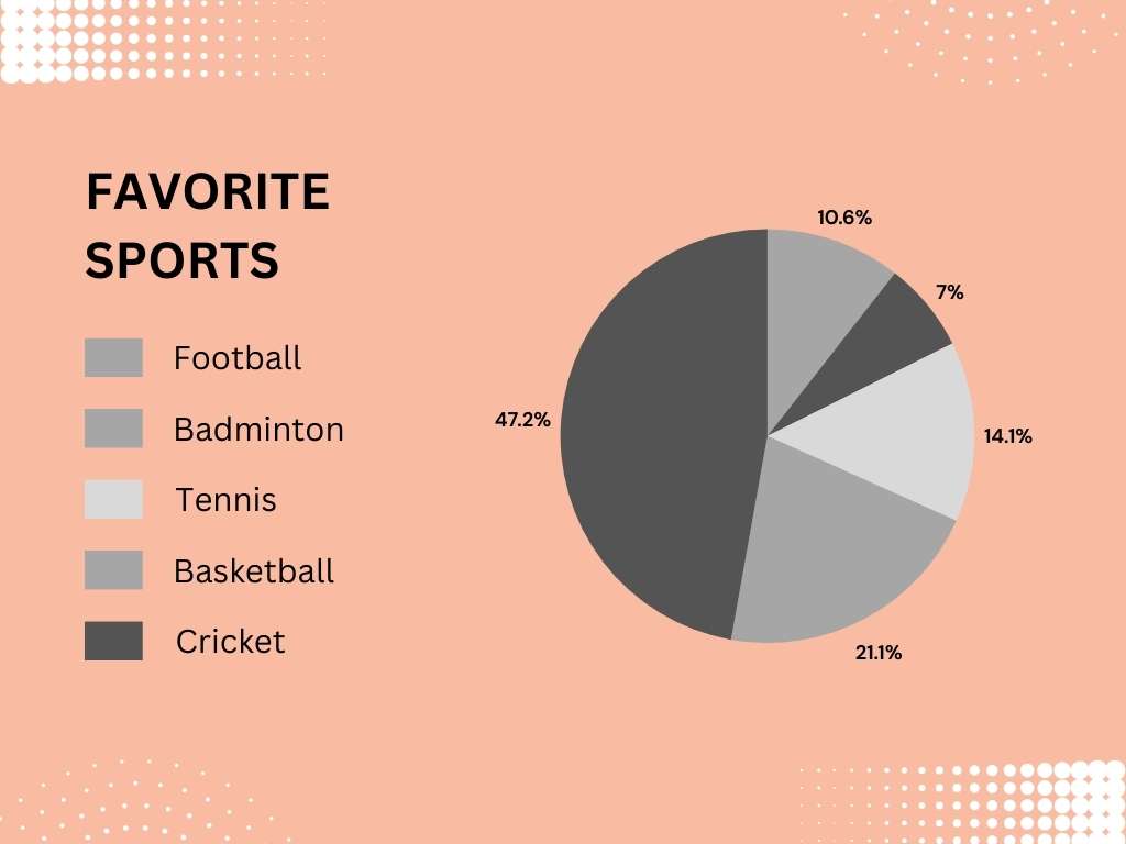
- Sufficient Color Contrast: Ensure that text and other essential elements have enough contrast against the background for those with low vision or color blindness. Be sure to convey information in both description text and color graphics. When color is the only way to understand the information (this pie chart, for example), it fails accessibility tests.

- Clear and Concise Language: Use simple, straightforward language that’s easy to understand for everyone, including those who speak English as a second language. Be cautious using metaphors, similies, or idioms.
- HTML over PDFs: Prioritize content in accessible HTML formats over less accessible PDFs. PDFs are difficult to read on smaller screens, take up valuable space in cell phone memory, and can be challenging for screen readers and assistive technologies. Text in HTML (words on the web page) allows for better resizing, reflowing, and compatibility with assistive tech. Plus, users can translate the content from your website with the push of a button.
Remember, accessibility isn’t just a box to check—it’s an ongoing journey. As technology evolves and new standards emerge, it’s essential to stay up-to-date and continue making improvements to ensure your website remains an inclusive space for all.
Our Crystal Ball
As technology continues to evolve rapidly, we can expect the Web Content Accessibility Guidelines (WCAG) to evolve. While the core principles of accessibility remain the same, a web-based on the principles of:
- Accessibility
- Internationalization
- Privacy
- Security
we may see updates addressing emerging technologies like virtual reality (VR), augmented reality (AR), and immersive web experiences.
Imagine navigating a website with just your voice or gestures, or having real-time captioning and audio descriptions for AR overlays. The future of accessibility could be as futuristic as it is functional! Additionally, with the rise of artificial intelligence (AI) and machine learning, we might see guidelines for ensuring AI-powered features and assistants are accessible to all users, not just those with perfect diction or speech patterns.
Future WCAG guidelines might tackle the issue of motion sickness and vertigo caused by excessive or poorly implemented scrolling and animation effects. To combat this potential accessibility barrier, guidelines could emphasize the importance of user control over animations, recommend frequency and intensity limits for motion effects, and suggest alternative methods for conveying information without relying solely on movement.
And let’s not forget about the increasing use of mobile devices and the unique challenges they present for accessibility. We could see more emphasis on mobile-first and responsive design, touch-friendly navigation, and optimizations for smaller screens. After all, accessibility should be a seamless experience, whether you’re browsing on a desktop, tablet, phone (or even a smartwatch!?).
So, while we can’t predict the future with 100% accuracy, one thing is certain: making the web more inclusive and accessible for everyone will remain a top priority.
Published on: May 31, 2024