THE CHRIST SCHOOL
Bringing New Light to The Christ School Brand
The Christ School (TCS), a private Christian K-8 institution, sought to modernize its brand while preserving its deeply rooted traditions. With a recently refreshed mission statement as the foundation, CEL’s goal was clear: to create a vibrant and cohesive brand that reflected the school’s joyful energy, Christian values, and accessibility focus.
Refreshing Identity Without Losing Tradition
Modern Logos Preserve Classic Heritage
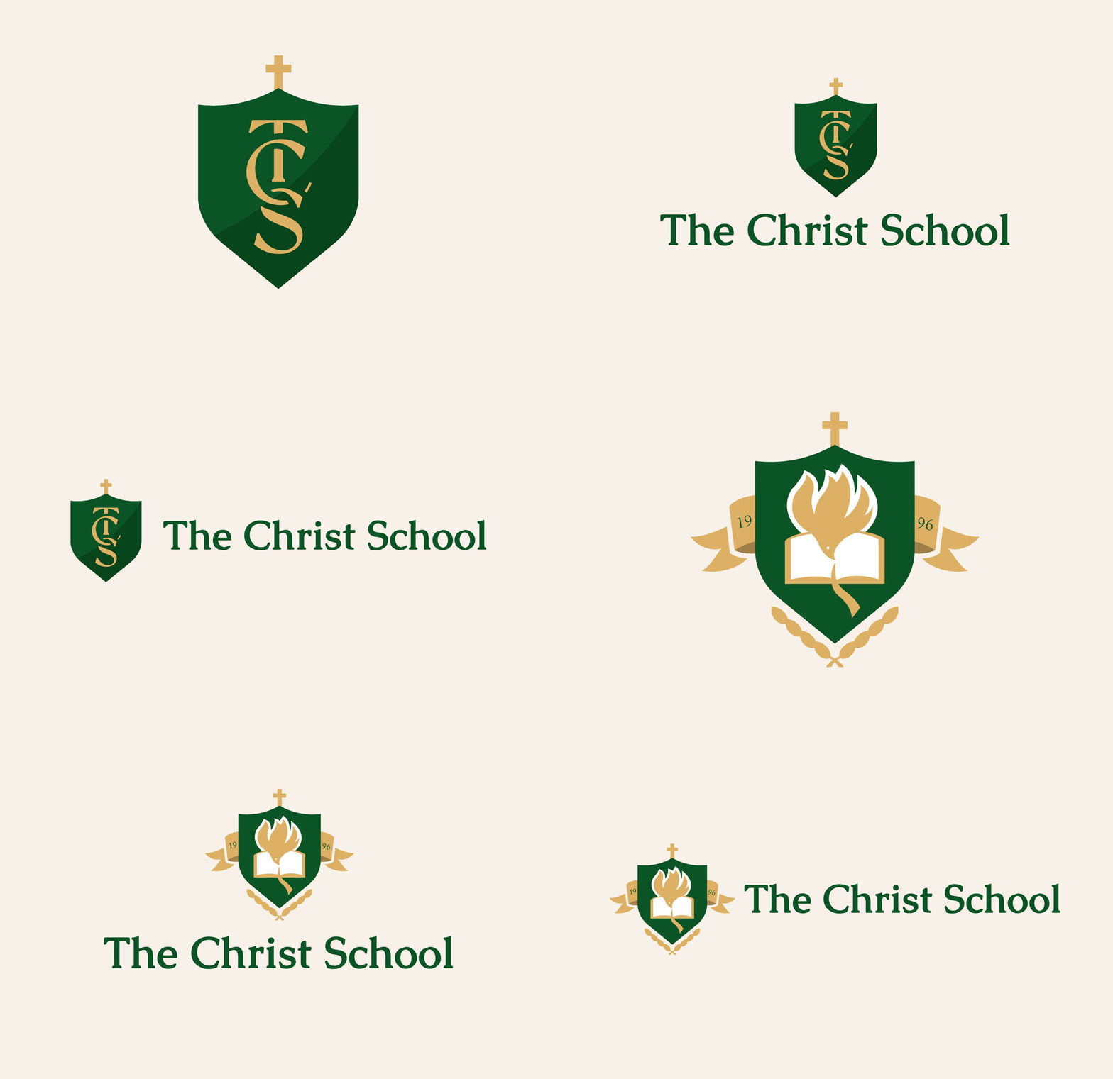
A successful brand refresh carefully balances contemporary design with the preservation of traditional and recognizable elements. The Christ School, with its long history and defining characteristics, sought a brand update that honored its core identity. Key elements like the mission statement and original crest logo remained central to their brand. Drawing inspiration from the mission statement and the school’s primary values, CEL made minimal refinements to the logo to enhance scalability and clarity. This updated crest logo is now reserved for formal applications, such as official documents and other professional branding needs.
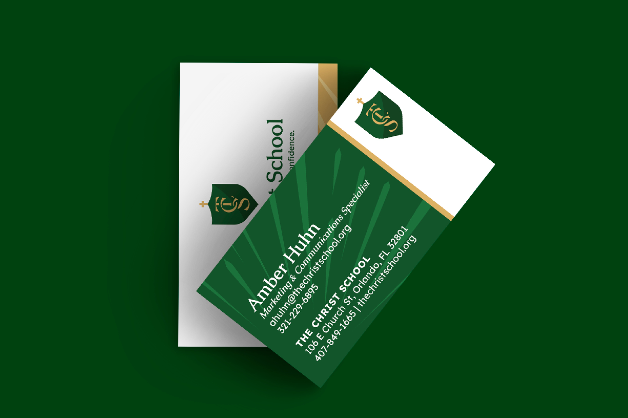
CEL introduced a secondary shield logo for more flexible, everyday applications. It features the ‘TCS’ acronym, a popular abbreviation warmly adopted by students, families, and the wider school community. This contemporary shield pays homage to the school’s roots and Christian foundation while launching the brand into the present day.
Color Palette Evolution
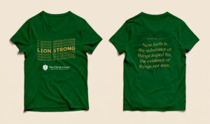
Across both logos and the brand as a whole, CEL adjusted the green and gold hues to bring warmth and vibrancy, mirroring the school’s welcoming spirit. Accent colors inspired by the school’s interior houses were also added, creating intentional, cohesive design options within the existing school structure.
Refining Roary—Unified Mascot Design
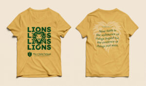
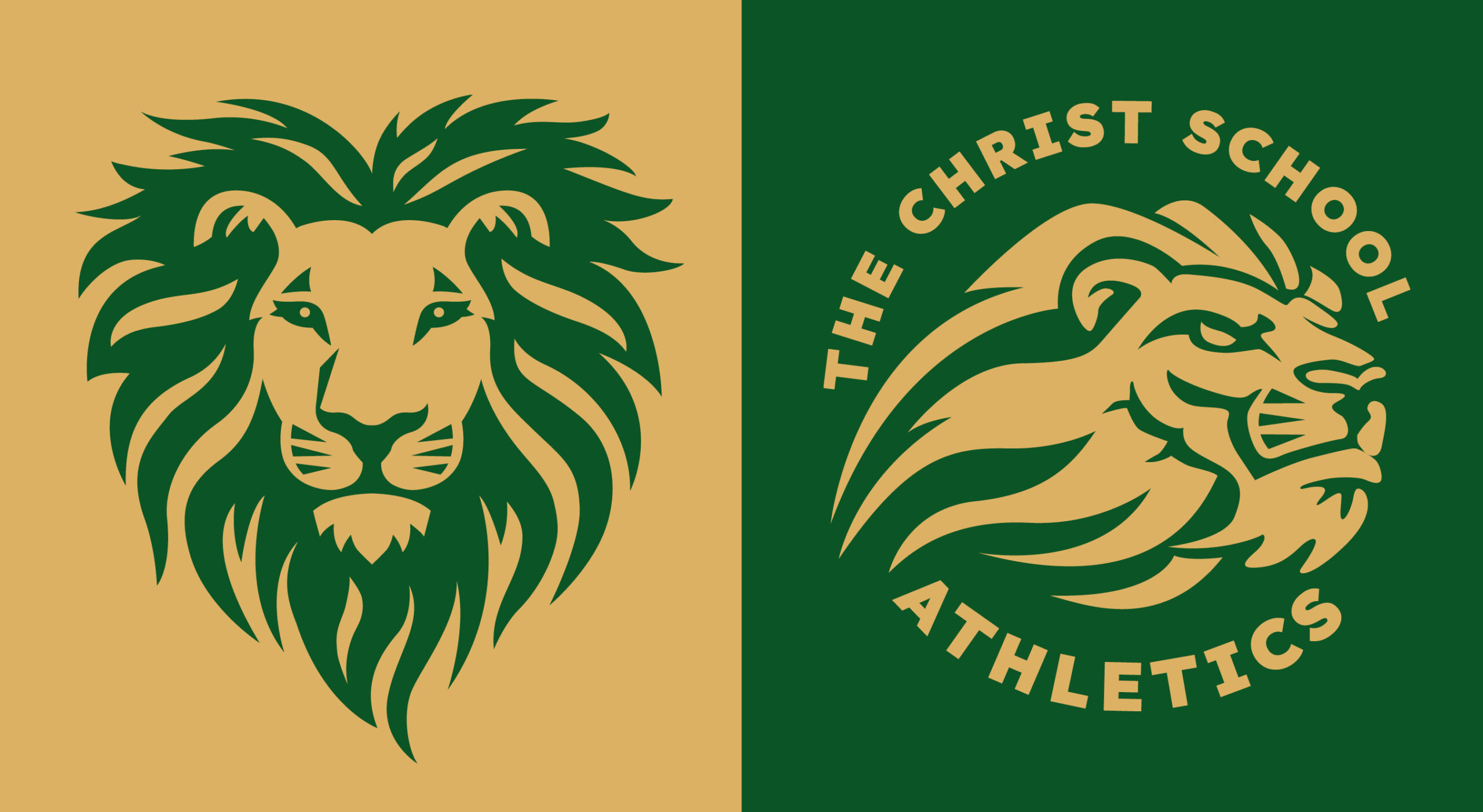
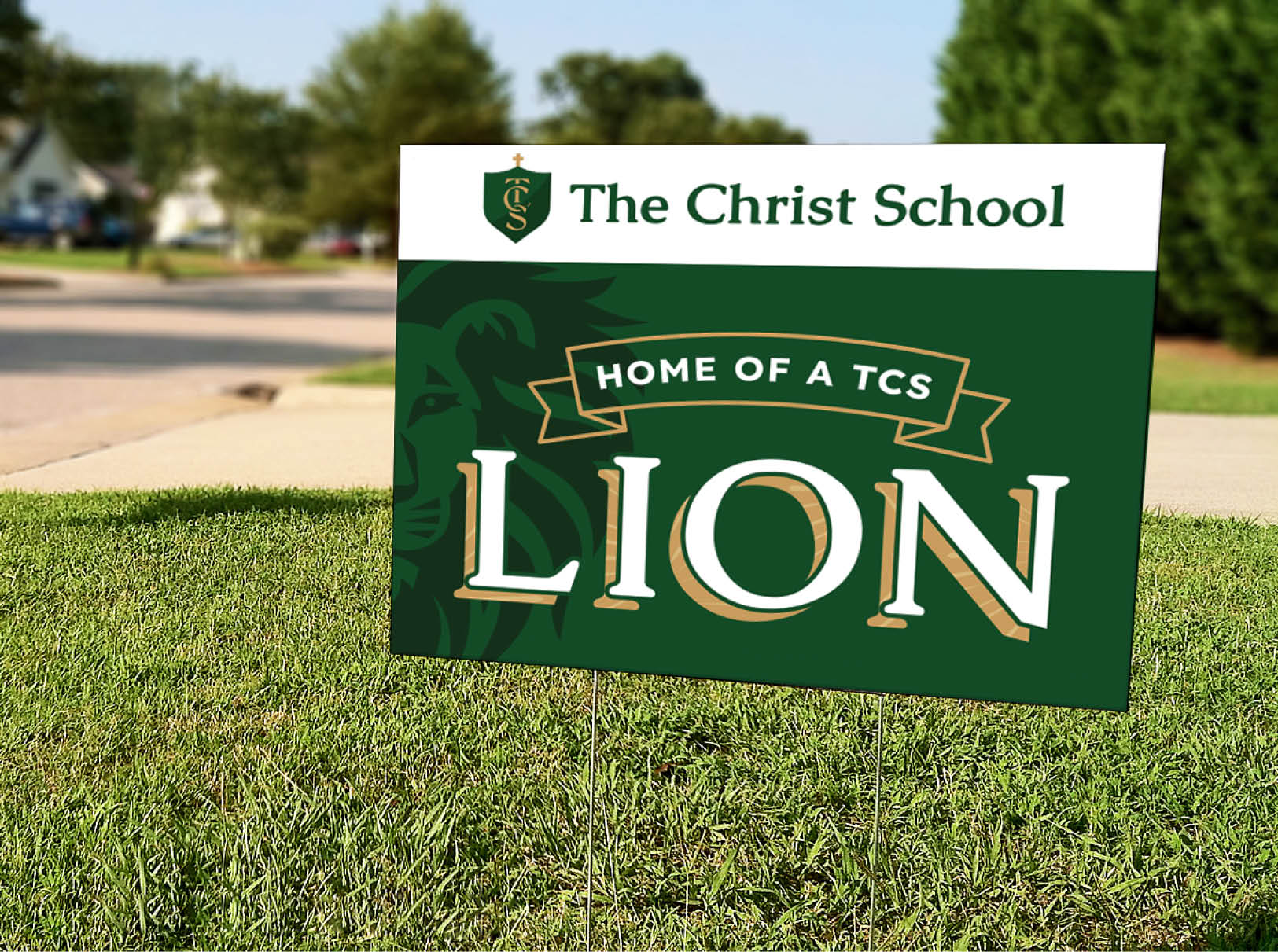
Roary the Lion has long been a symbol of The Christ School, but his mascot design felt more juvenile than regal. TCS originally used two distinctly different versions of their mascot, Roary the Lion—one for the athletics department and one for the school. After thoughtful review, the athletic version of Roary, with its side profile and bold art style inspired a new forward-facing school mascot design. This updated Roary features a heart-shaped mane with kind, wise eyes, preserving the essence of the original school mascot design. CEL ensured the new design reflected the school’s values of courage, integrity, and empathy, resulting in two complementary Roary mascots that are both scalable and refined.
BEFORE

AFTER

Inspiring Patterns from Core Principles
Throughout the branding process, staff input along with student and family feedback provided a rich collection of adjectives, key traits, and core values. These insights often inform key messages, taglines, and other written content central to the brand. Certain themes, like the ‘collegiate’ feel of TCS, appear consistently across various elements, including the school logo and typography. Among the most frequently mentioned values were ‘warmth’ and ‘joy,’ which are deeply embedded in The Christ School’s identity—from the lively hallways to the enthusiastic teachers and the compassionate Christian education.
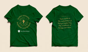
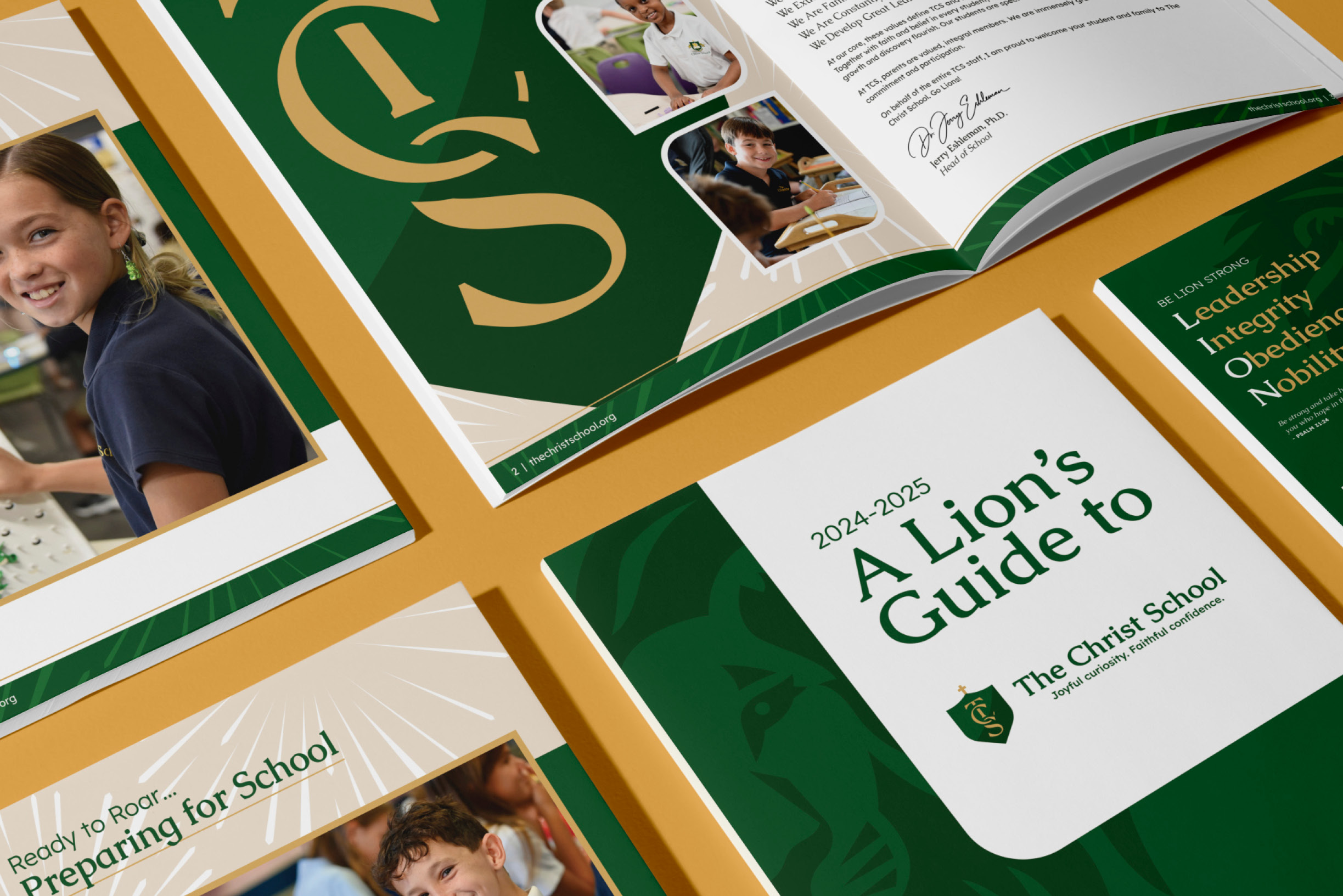
CEL capitalized on the opportunity to visually represent TCS’s warmth and joy through a dynamic pattern. This burst-of-light design radiates joy and energy, symbolizing the light of Christ. It infuses the brand with fresh vitality and seamlessly integrates with other visual elements.
Prioritizing Accessibility by Design
Alongside the primary branding refresh, The Christ School sought to align its brand with The Bridge, a specialized program within TCS for students with dyslexia. The Bridge’s sub-brand received an update to better harmonize with the refreshed TCS logo and overall brand treatment.
A key aspect of the new brand, alongside the refreshed logo, was the creation of accessible branding elements for all learners, particularly the school’s dyslexic community. Typography played a crucial role, with CEL carefully selecting fonts that were both accessible and dyslexic-friendly. The chosen sans-serif font not only provided adequate lettering space for readability but also aligned with the school’s desire for a collegiate yet legible typographic style.
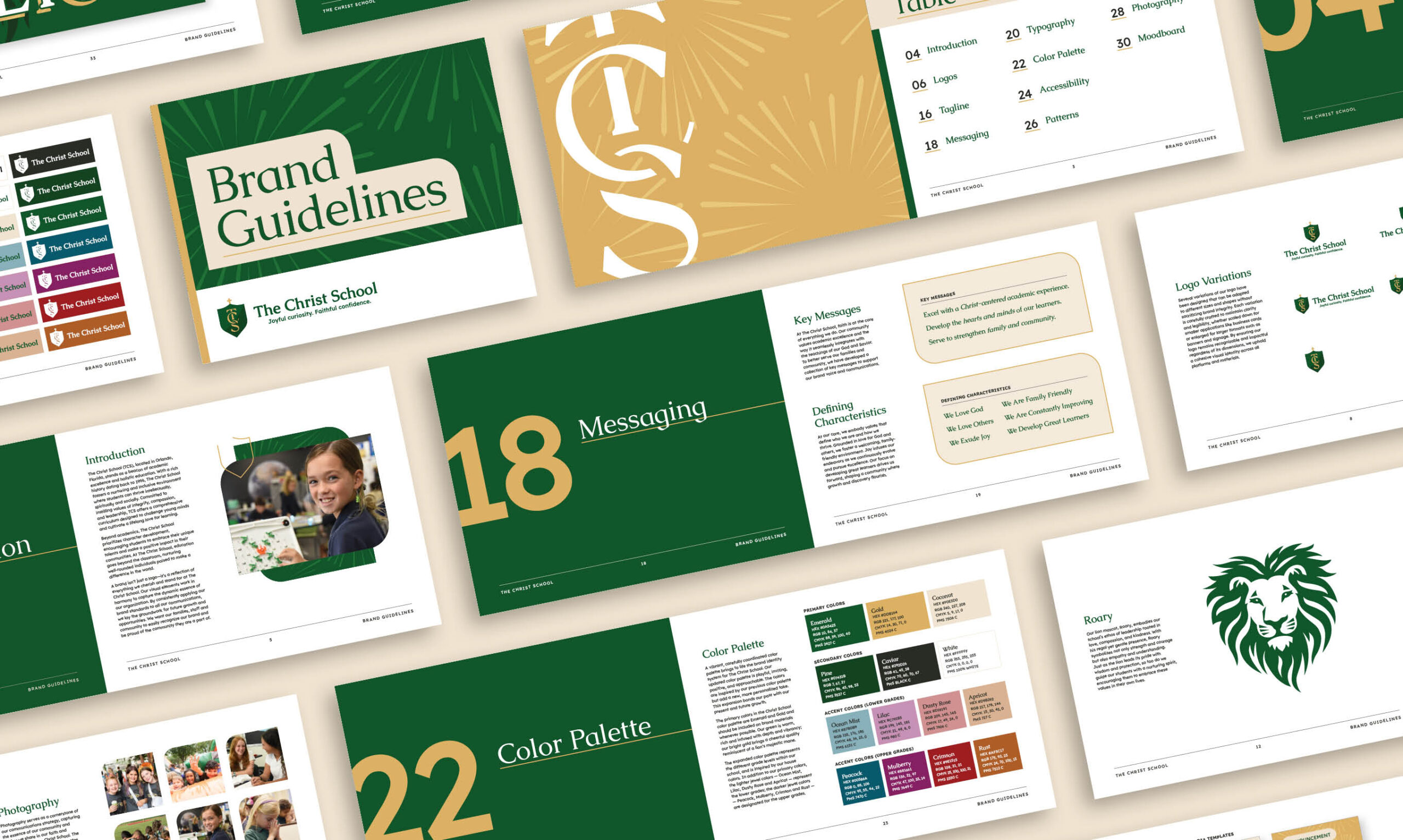
To ensure that the full branding suite met accessibility standards, CEL created a comprehensive brand guide. This guide ensured that text and background color combinations complied with ADA requirements, assisting TCS staff and the broader community in adhering to both dyslexic-friendly and general accessibility guidelines.
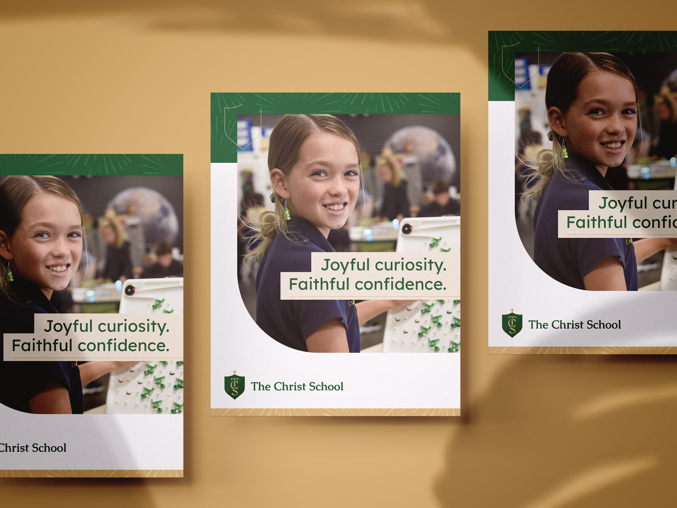
The refreshed brand for The Christ School seamlessly blends honoring tradition and embracing contemporary design. By thoughtfully refining key elements like the crest logo, mascot, color palette, and typography, CEL captured the school’s vibrant spirit, timeless values, and commitment to accessibility. The revitalized brand celebrates TCS’s rich heritage and is well-positioned to inspire its community, nurture joyful curiosity, and instill faithful confidence for generations to come.
