SCHOOL MASCOTS
Elevating Your School’s Identity Through School Logo and Mascot Redesign
Your school logo and mascot are potent tools that can shape perceptions, forge connections, and leave a lasting impression.
Imagine this: a logo that effortlessly communicates your school’s values and resonates deeply with your students, staff, and community. It’s not merely a graphic; it’s a storyteller, conveying the essence of your institution’s culture and aspirations. A well-crafted school logo can be your ally in reaching enrollment goals, fostering school spirit, and creating a consistent and compelling brand.
Revitalizing your logo and mascot can be a catalyst for positive change. A well-executed redesign can bring clarity to your messaging, strengthen your brand’s presence, and, ultimately, position your school for success.
Princeton Public Schools: From Chaos to Cohesion
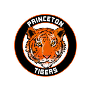
Problem: The district mascot was complex, reproduced poorly, and was inconsistently used across schools and programs. A district communications audit revealed that the tiger mascot resonated with the community, but the school logo itself no longer represented the innovative district Princeton has become.
Solution: We streamlined Princeton Public Schools’ brand by creating a simplified, easily reproducible mascot and deployed it across the website and print communications. This newfound consistency improved their brand perception and made the logo usable for various marketing campaigns.
BEFORE
AFTER
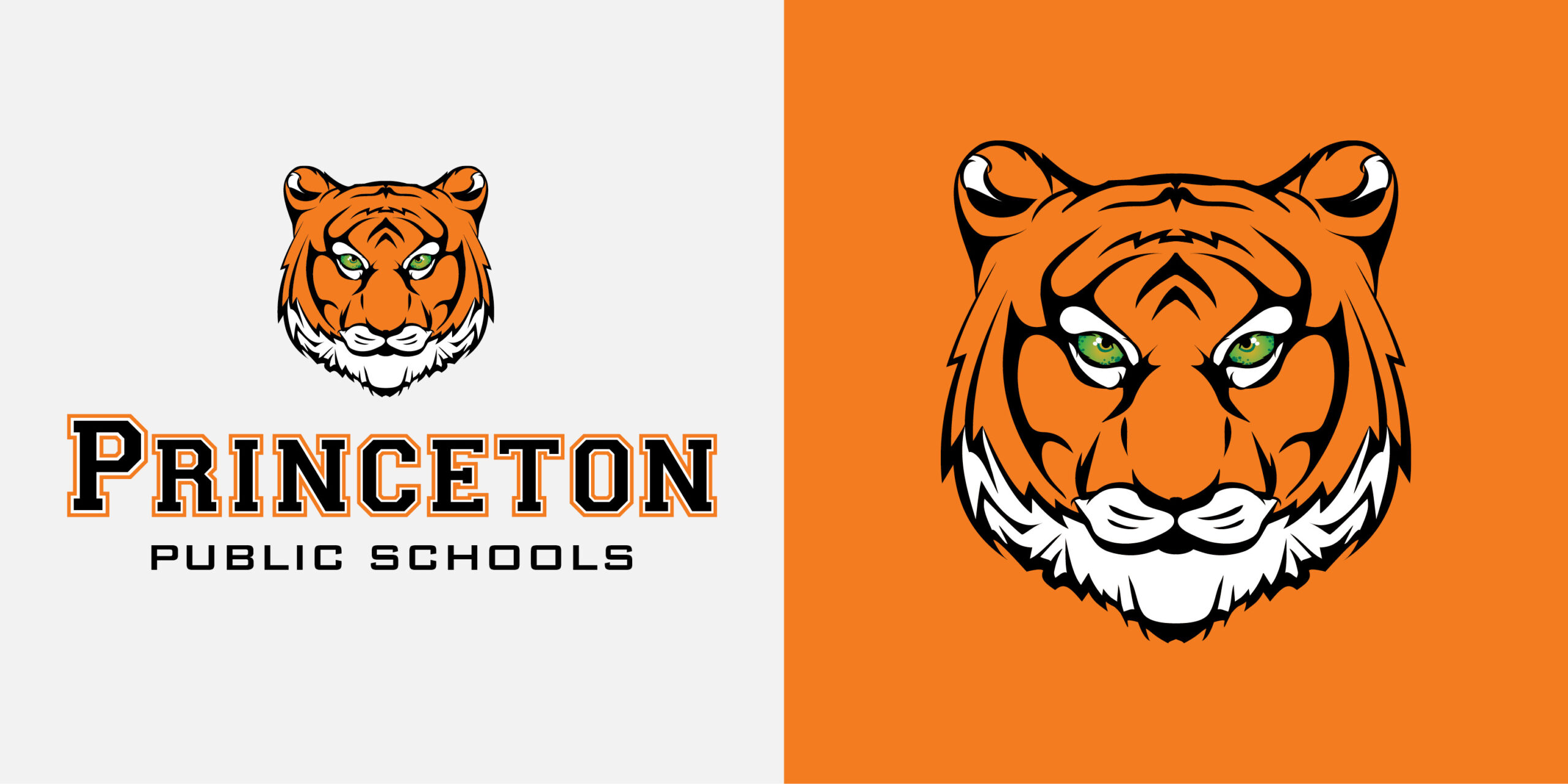
Special Considerations: Should the tiger be fierce for athletics or cuddly for elementary school use? CEL designers worked with school stakeholders to develop the tiger mascot for the district, expanded the districts color palette with softer tones to compliment the orange and black, and created different logo lock-ups for each school — with tiger cub paw prints at the primary and claw marks for middle school. The brand refresh and font design allows maximum branding and design flexibility.
Middleton Mustangs: Giving Life to Marty
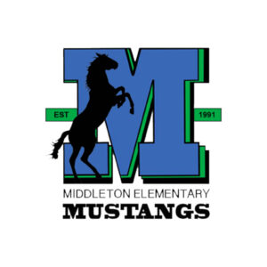
Problem: Middleton Elementary’s mascot design didn’t inspire or excite stakeholders. Additionally, the school logo was difficult to scale: the horse’s tail and the school name became indecipherable at a small size.
Solution: We brought Marty the Mustang to life with a more child-friendly appearance. We incorporated existing Middleton Elementary colors but brought in colors from the district logo to ensure consistency between the school’s identity and district branding. The school name is no longer hidden in tiny letters at the bottom—the Middleton Mustangs stand loud and proud.
BEFORE
AFTER
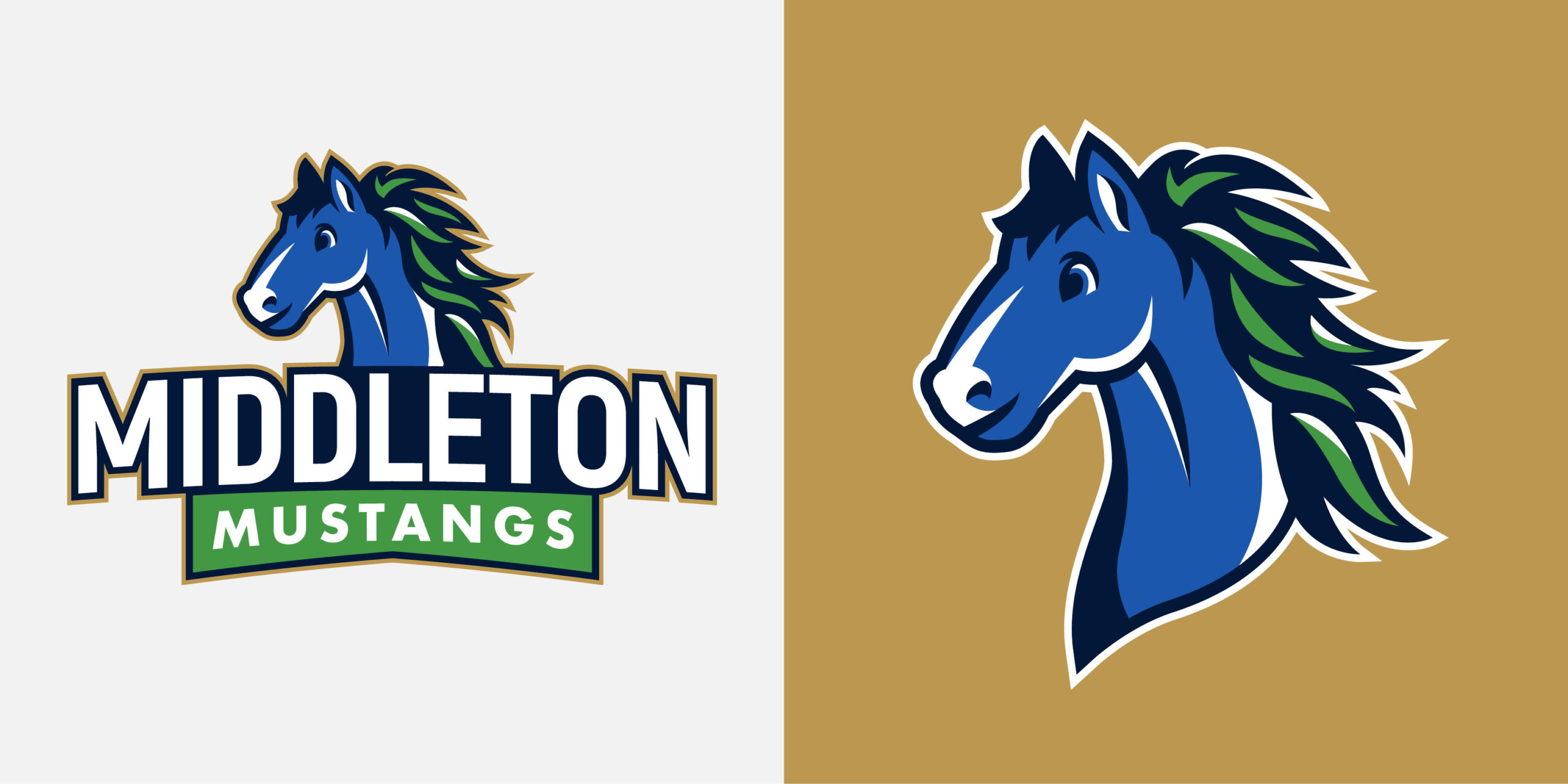
Special Considerations: Involving stakeholders, especially students, can lead to a more authentic and engaging mascot. Middleton students appreciated sharing their opinions on the proposed mascot designs and instantly developed a love for their new mascot.
Details matter. Marty may be blue, but people who know horses will recognize that Marty is a mustang. It’s essential to get details right, and no matter how cute a palomino would be, CEL designers knew Marty needed to live up to his promises of mustang glory.
A school logo is a workhorse.
Sometimes literally. But no matter your logo, not only does it represent the school, but it should also tie in with district branding. Plus, it should be memorable and easily recognizable—when paired with other school brands, is it easy to find your school? A consistent school logo and mascot will help build recognition and loyalty.
Nuevas Fronteras: A Modern Twist on Tradition
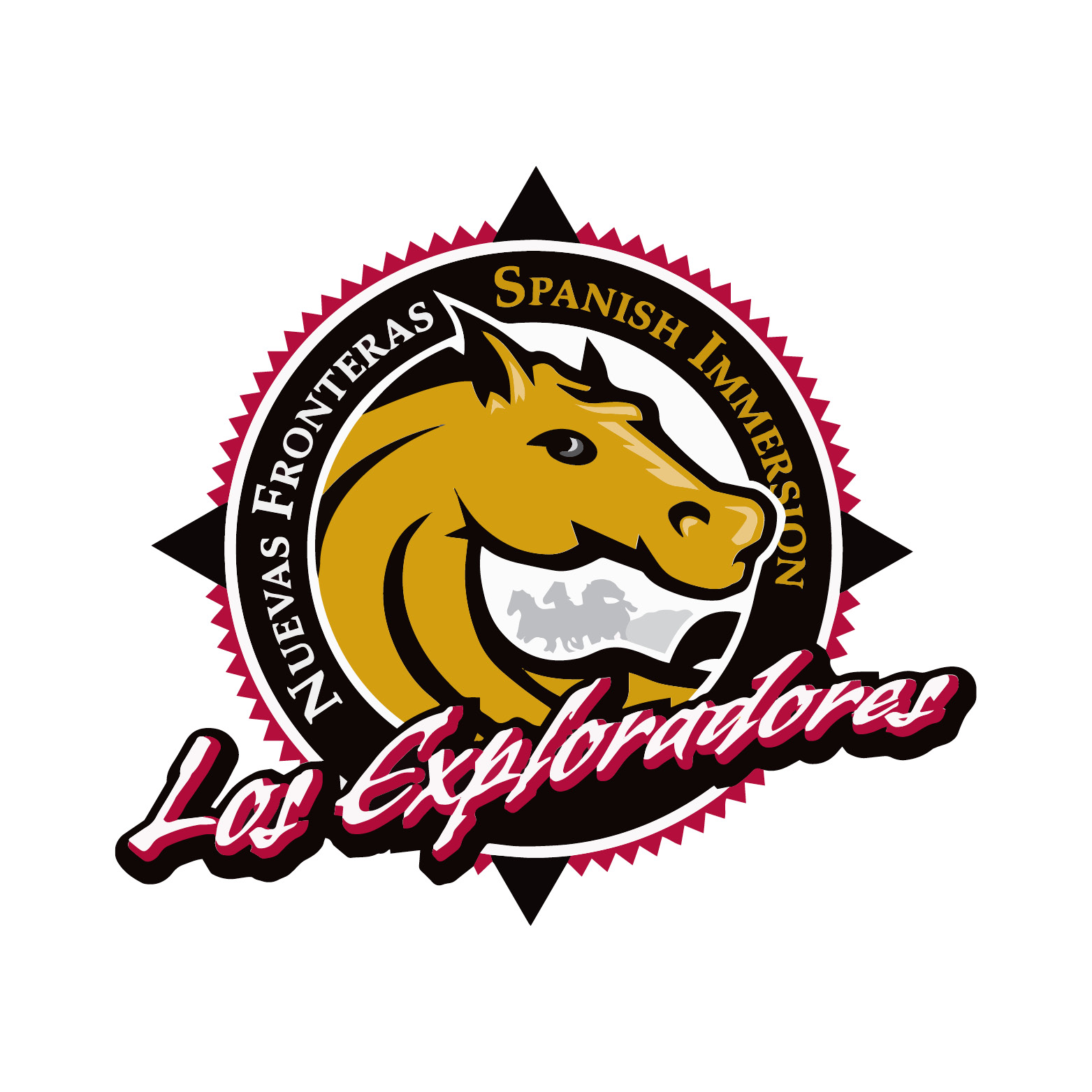
Problem: Nuevas Fronteras, a Spanish immersion school, felt its mascot was outdated and out-of-touch for a contemporary audience. The symbolism behind the horse mascot no longer served the school.
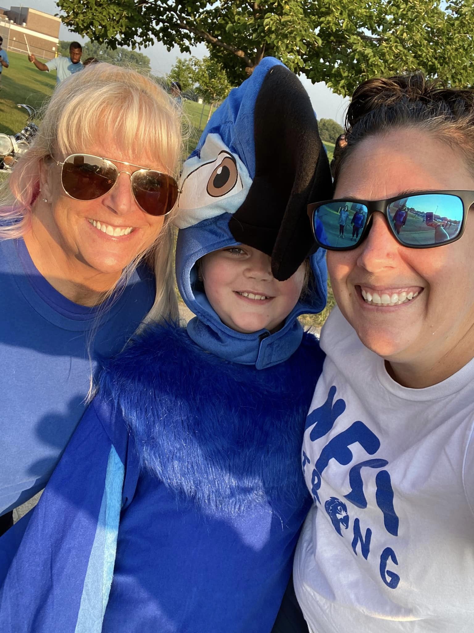
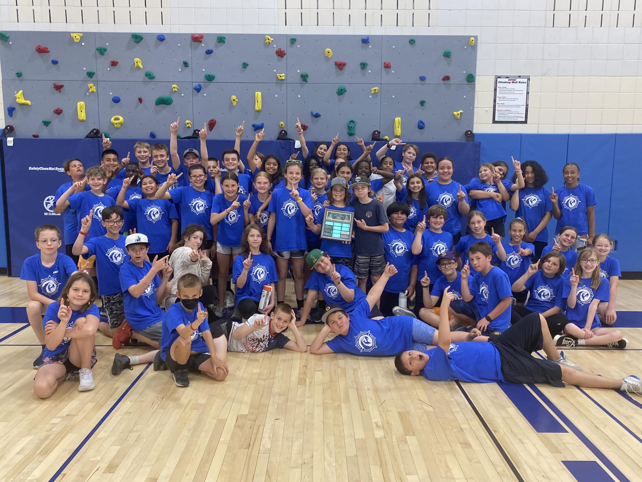
Solution: Students voted, and the mascot they felt best represented their school? A colorful parrot. We introduced a fresh, parrot-themed design that aligned with the district’s colors and maintained some cherished existing elements, like the compass. This change ensured a modern and meaningful brand that respected tradition while embracing the new.
BEFORE
AFTER

Special Considerations: By honoring the work of the past while embracing innovation, you can successfully move forward with a new design. The critical piece is listening to your community to understand what’s working and what’s not. Changing a mascot or school logo steeped in tradition feels risky, but sometimes, moving forward is the right decision (just ask the Washington Commanders).
Valley Crossing: Soaring to New Heights
BEFORE
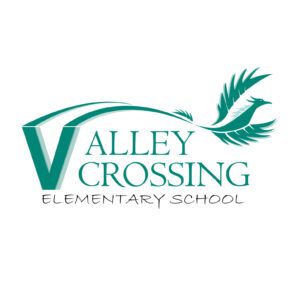
AFTER

Problem: Is it a bird? Is it a plane? Is it a dragon?! A dragon would be cool, too, but Valley Crossing wanted a refresh of their phoenix that posed fewer “so…what is it?” questions. Additionally, they were hoping for a more modern font to bring their school logo up to contemporary design expectations.
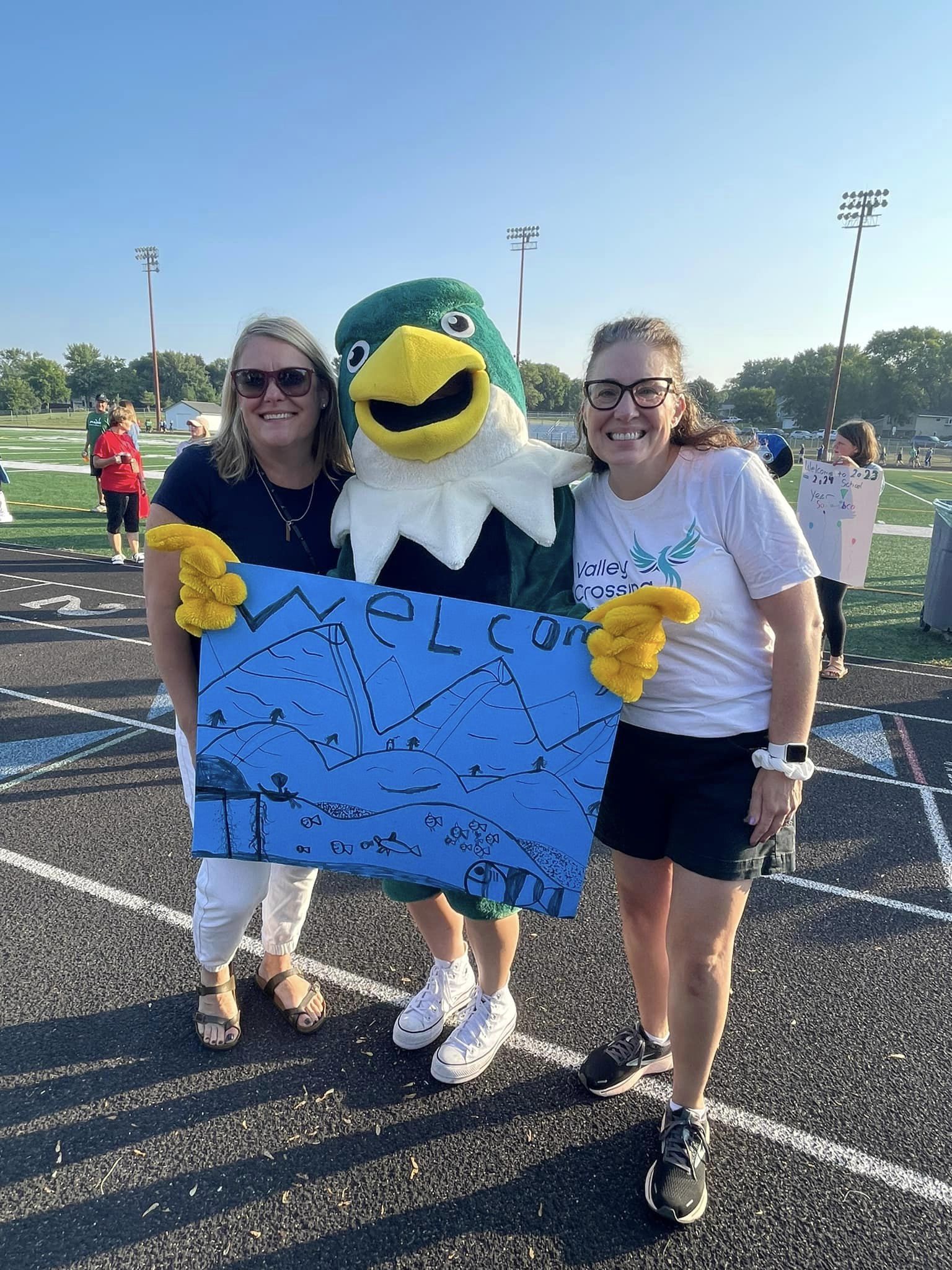
Solution: We redesigned the mascot based on stakeholder feedback. The bird soars upward, reflecting the school’s commitment to progress and growth. Stakeholders liked the original teal color, but it didn’t match the district’s color palette. The solution is a design that marries the existing color with district branding in a beautiful blend that helps Valley Crossing stand out from the crowd (in a good way) and looks great both digitally and on print.
Special Considerations: AI can design a great looking school logo for you, but it’s no good if it’s not useable. Using a graphic designer to create logos will ensure you have functional, scaleable graphics that work on signs, social media, and even socks if you wish! You’ll want single-color, full-color, and simplified logos alongside full school name lockups for full design flexibility.

Menasha Joint School District: Just a Little TLC
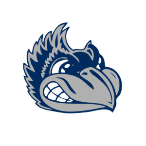
Problem: Menasha loved its mascot but was hamstrung by a lack of original files. Everything they owned was squished, tweaked, or pixelated.
BEFORE
AFTER
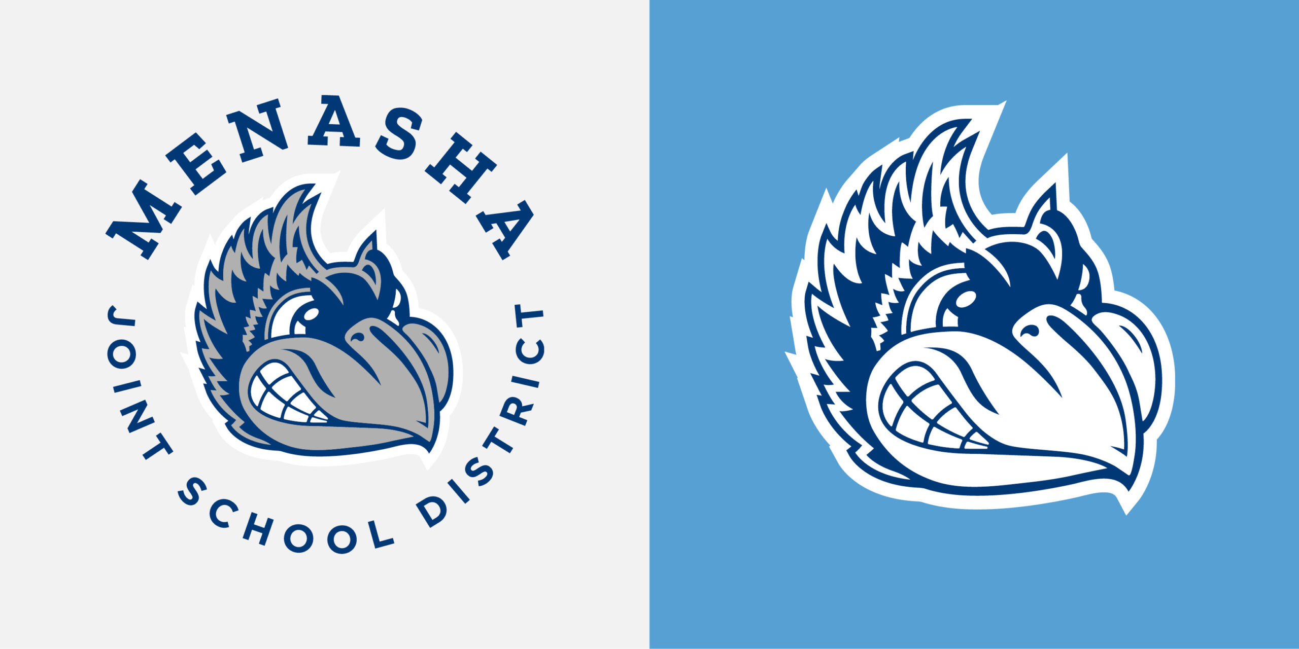
Solution: Spot the differences yet? Only people with a keen eye will see changes from the before and after. We preserved Menasha’s unique identity by cleaning up its existing school logo. The improvements were subtle but significant, demonstrating that even small changes can make a big difference.
With minor alterations to color, line weight, size and spacing, the Menasha mascot is now ready for any possible use.
Richfield: Embracing Tradition with a Modern Twist
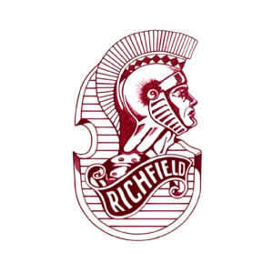
Problem: This is RICHFIELD! The spartan carried the weight of tradition on his shoulders, but Richfield Public School District desired something more modern. The original school logo design was complex and difficult to use across platforms.
Solution: We modernized the Spartan mascot. Stakeholders’ input was crucial in achieving a balance between tradition and innovation. The new logo united the district’s athletic and academic identities.
BEFORE
AFTER
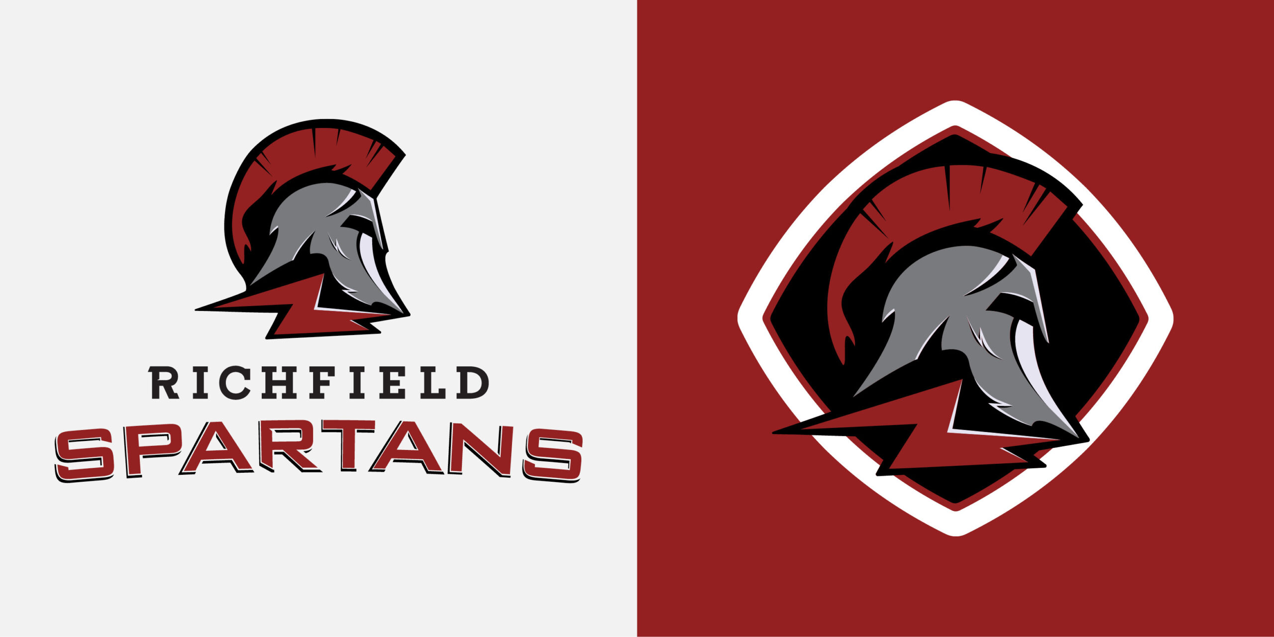
Special Considerations: The school district wanted a school logo design where the mascot could stand alone. This custom design ensures the spartan screams Richfield when paired with the words—and without.
Some Richfield district schools desired a similar refresh—by using consistent branding elements like patterns and color palettes, the school mascots flawlessly fit into district branding.
The Power of Visual Storytelling
➡️ My School Logo…Lacks Versatility
One of the most common challenges we encounter is logos that aren’t practical for real-world applications. Maybe your logo was designed so long ago that you only have one file (and it’s not scalable vector art). Perhaps your mascot looks suspiciously similar to a professional sports team. Or possibly, your school logo or mascot uses Indigenous imagery that is no longer appropriate—or legal.
Designs should be versatile, easy to reproduce, and work across various media. If your logo or mascot lacks flexibility and useability, it’s time to refresh.
➡️ My School Logo…Yearns for a Modern Update
Outdated designs can hinder a school’s image and fail to resonate with a contemporary audience. Education is driven by technological advancements, changing pedagogical approaches, and shifts in student demographics. An outdated logo can make your school appear out of touch with these changes, potentially deterring prospective students, parents, and stakeholders.
In an era dominated by digital communication, school logos must be adaptable to various digital platforms, from websites and social media profiles to mobile apps. Outdated logos may translate poorly across these mediums, which limits your school’s online presence.
➡️ My School Logo…Shouldn’t Be a Mystery
Look around. How many versions of your mascot can you find in your schools? Chances are, if you don’t already have a logo and brand guidelines in place, your visual identity has stretched over time. Without a consistent visual identity to anchor their brand, schools and districts are left at a disadvantage when it comes to communicating their essence to prospective families.
Effective branding extends beyond just a logo; it encompasses color schemes, typography, and visual elements that harmonize. Without a logo as a unifying element, various communications, whether digital or physical, lack consistency. This absence of visual cohesion can make your school’s messaging feel disjointed and less impactful.
School logos are more than just graphics; they embody an institution’s values, culture, and aspirations. By addressing our school clients’ unique challenges, we’ve helped them create logos and mascots that resonate with their communities, enhance their brand identities, and pave the way for a brighter future.
If your school faces similar branding challenges, we’d love to hear from you and explore how we can help tell your story through design. Contact the CEL team today.

