Essential Photo Tips to Stand By
You don’t have to be a professional photographer to follow a few essential photo tips and grab your audience’s attention. Consider these tips when taking a photo with your phone or even selecting a photo from stock images.
Best Practices for Taking Photos
- Always take landscape orientation photos as they are easier to use on materials (landscape = horizontal rectangle)
- Ensure your photos are in focus, well-lit and clear
- Any person who can be identified in a photo should have a media release signed
- Any people in photos should adhere to organization policies and style guidelines (watch clothes, casual or professional appearance, and looking into or away from the camera)
- For optimal lighting, the photographer’s back should be to windows or the sun
- Ensure that all photos highlight people embracing the organization’s values of inclusion, diversity and respect.
Best Practices for Smartphone Photography
- If outside, take photos near shade instead of direct light. If you place your subject near the edge of shade, this creates a diffused, soft light that is more aesthetically pleasing.
- Use your portrait mode to isolate your subject from the background. Portrait mode blurs the background and makes your subject pop in the photo.
- Tap the screen to “tell your smartphone where to meter the light from so you end up with a clear shot.” This helps make sure that the sky isn’t overexposed or your subject is underexposed. The entire image will be more clear.
Best Practices for Image Usage
- Keep it simple
- Use fun, in-focus images of people (remember media releases) and use alt tags
- Ensure the overall image selection on the website accurately displays the organization’s demographics — be inclusive and representative
Website and Social Media Photo Tips
Website Sizing
- Take photos that have “negative space” around the focal point (i.e. allow plenty of extra area around the subject, in case the image crops when viewed on desktop or mobile devices). This will allow you to use the photo in more ways across multiple materials. Sizing is as follows:
- 512 x 288 px for mega menus (can go up to 1920 x 1080 px)
- 1920 x 1080 px for most featured images on a home page
- 818 x 430 px for page images and thumbnail in a news item
Social Media Sizing

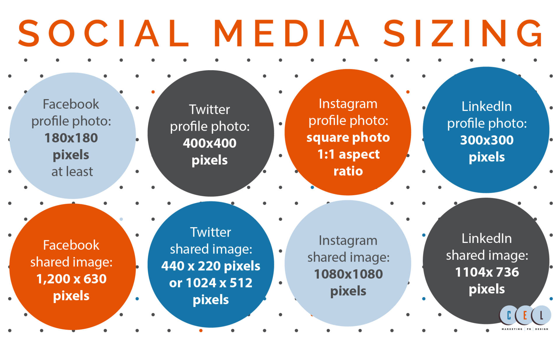
- Facebook profile photo: at least 180×180 pixels
- Facebook shared image: Recommended upload size of 1,200 x 630 pixels
- Twitter profile photo: 400×400 pixels
- Twitter shared image: Minimum to appear expanded 440 x 220 pixels (a 2:1 ratio), maximum to appear expanded 1024 x 512 pixels
- Instagram profile photo: Square photo: maintain an aspect ratio of 1:1
- Instagram shared image: 1080×1080 pixels
- LinkedIn company logo profile photo: 300×300 pixels
- LinkedIn shared link or image: 1104x 736 pixels
Tools and Resources
- Easily crop and edit photos with the free Canva, GIMP or Pixlr online tools (available on both computer and mobile devices)
Tips on Images to Avoid
- Never use ClipArt
- Never stretch your photos horizontally or vertically (keep photo dimensions same as original/cropped image)
Why Photos are important

Photos are just as important as the words you pair them with. Some even say they’re the most important since our brains are wired for images. Ultimately, photos drive engagement and boost traffic to your content. So much so, research confirms that people are 80% more likely to read content that includes an image and 64% more likely to remember it afterward.
It’s not only important to choose high-quality, relevant images for user experience but also for SEO. To make sure your photos will help your SEO, remember to give your images a custom filename and use alt tags.
Overall, images are fun to play with and boost engagement! Just remember to follow these essential photo tips for best results.
Published on: March 3, 2020