Branding & Design
Back To Insights

Branding: 3 Key Elements for Going Beyond Your Logo

Logos love the spotlight. They’re almost always in a place of prominence. They span the entire range of communications, from sales collateral to banner ads and ballcaps. And then of course, there’s the common question, can we make the logo bigger? 

Well, we have news for your logo. Sharing the spotlight makes it even more powerful. And by sharing, we mean expanding the visual identity system of your brand to include a broader color palette, vibrant patterns and memorable imagery. Since March is Branding Month, let’s take a moment to take a fresh look at visual identity systems.

Accent Colors Add Punch

Pop quiz — name the tractor brand identified by the color green. What about the delivery company built on brown? Or the technology company nicknamed Big Blue?

Many brands have a signature color and often a complementary tone, but the clear trend today is to include accent colors, which is what we did for the award-winning brand expansion of Richfield Public Schools. Red will always be the district’s primary color, but a broader palette allows for a more playful, friendly and diverse brand expression. 

richfield public schools branding grid

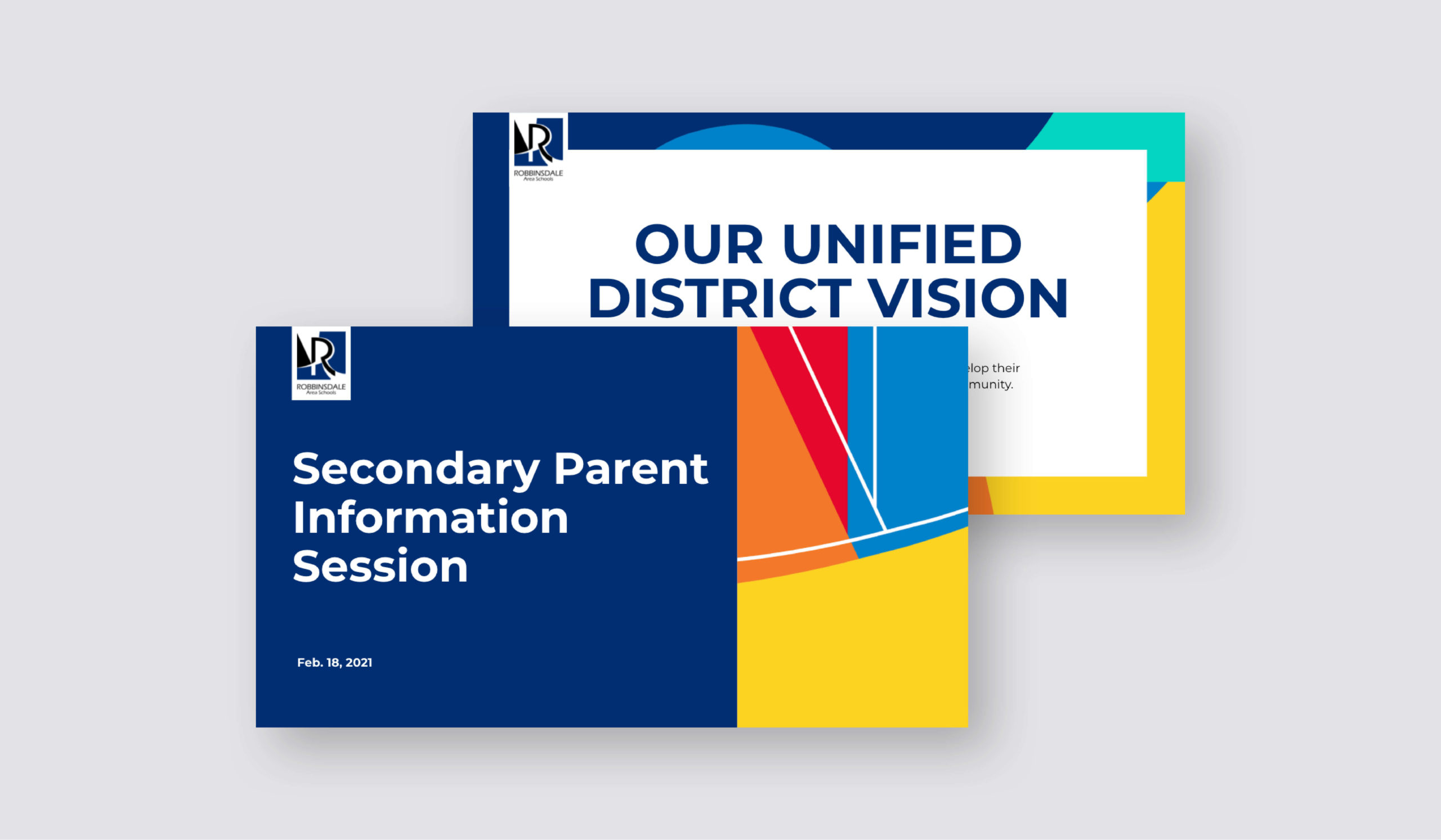
For Robbinsdale Area Schools, an updated color palette supported the district’s unified vision — enlisting each school’s colors — and bringing joy and energy for a more modern feel.

Robbinsdale PowerPoint Template

Note, too, that a distinctive color can help a brand stand out in a crowd. Our branding work for Mint Roofing introduced an eye-popping color that draws the eye to everything from truck wraps to apparel. The brand identity system also includes complementary colors, and it’s important to make sure they offer good contrast for accessibility.

mint roofing wrapped vehicles

Patterns With A Purpose

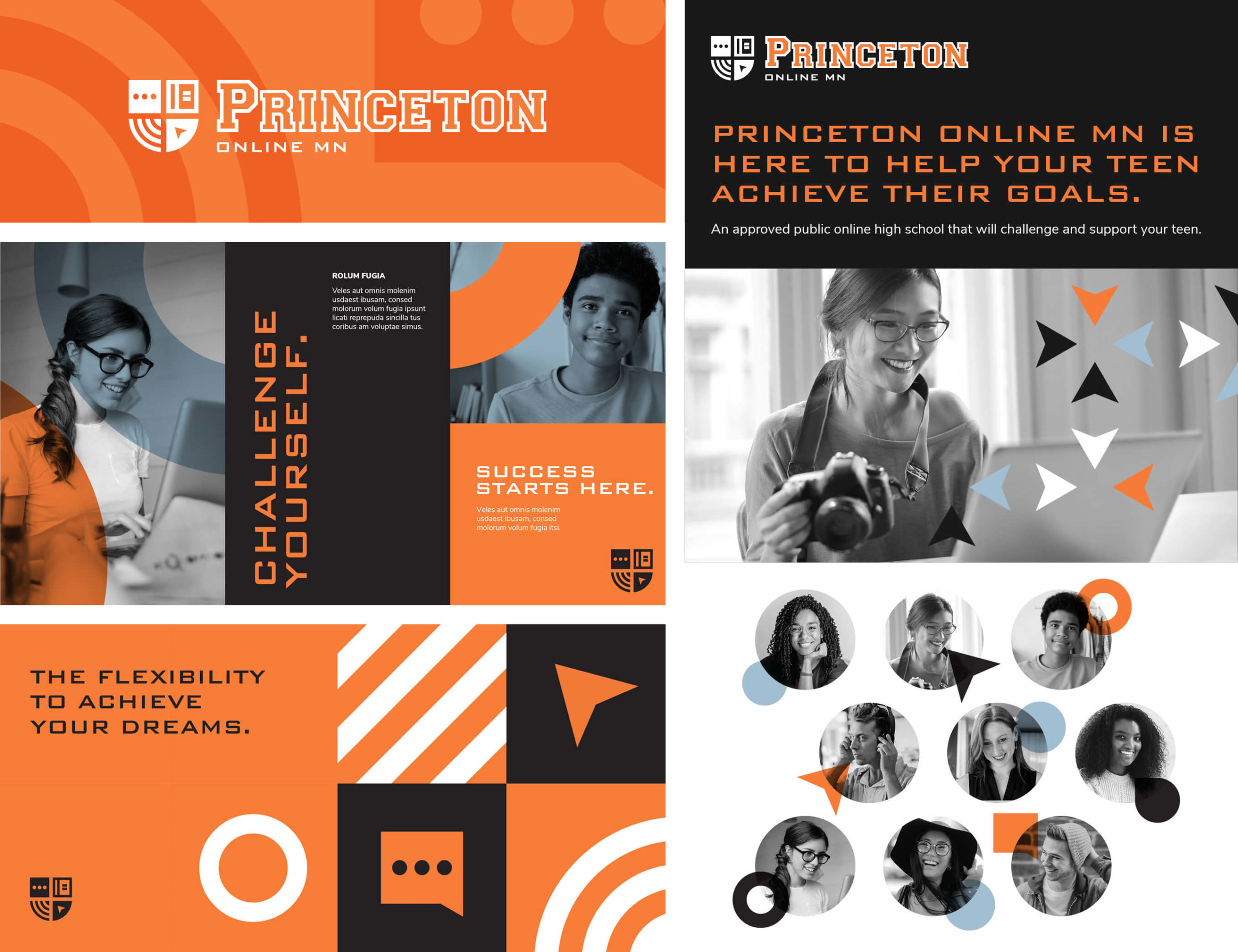
For Princeton Online MN, our design team added accent colors to the essential black and orange color scheme and established a consistent photo treatment using black and white photography and colored overlays. But we also created patterns to expand the visual identity system even further. 

Patterns may come from a wide range of sources, including colors, geometric shapes or even lines or angles that echo and reinforce the main brand logo. Some patterns suggest movement, others a sense of stability. Each offers another tool for connecting with audiences and building a consistent brand identity.

princeton online showcase materials

Image is Everything

Photos and images range from the artistic and expressive to the concrete and real world. Making a conscious decision about the style is a critical consideration in successful visual branding. 

After expanding the color palette for Southdale ObGyn, the photo style we incorporated humanizes the brand by showcasing faces, with permission of actual patients, to demonstrate the close, caring conversations among staff and patients. The “Not So Secret Life of the Southdale Team” included personal photos and stories to humanize the brand through a social media campaign.

southdale color patterns for brand expansion

A school system might choose a snapshot style to reflect the spontaneity and energy of its student body. A professional services firm might choose a more polished business look to communicate its expertise and thoroughness. Whatever the decision, a consistent approach to photography and imagery maintains brand integrity across all media.

Want even more insight for Brand Month? Here are some additional resources:

Published on: March 3, 2021

Topics:

RELATED POSTS