MENASHA JOINT SCHOOL DISTRICT
From Mascot Refresh to Brand Evolution
What started as a simple mascot refresh evolved into Menasha Joint School District embracing a full-scale brand expansion to modernize its visual identity. The goal was clear: enhance brand clarity and increase flexibility and usability across digital and print to adapt to diverse applications—all while preserving the district’s core identity.
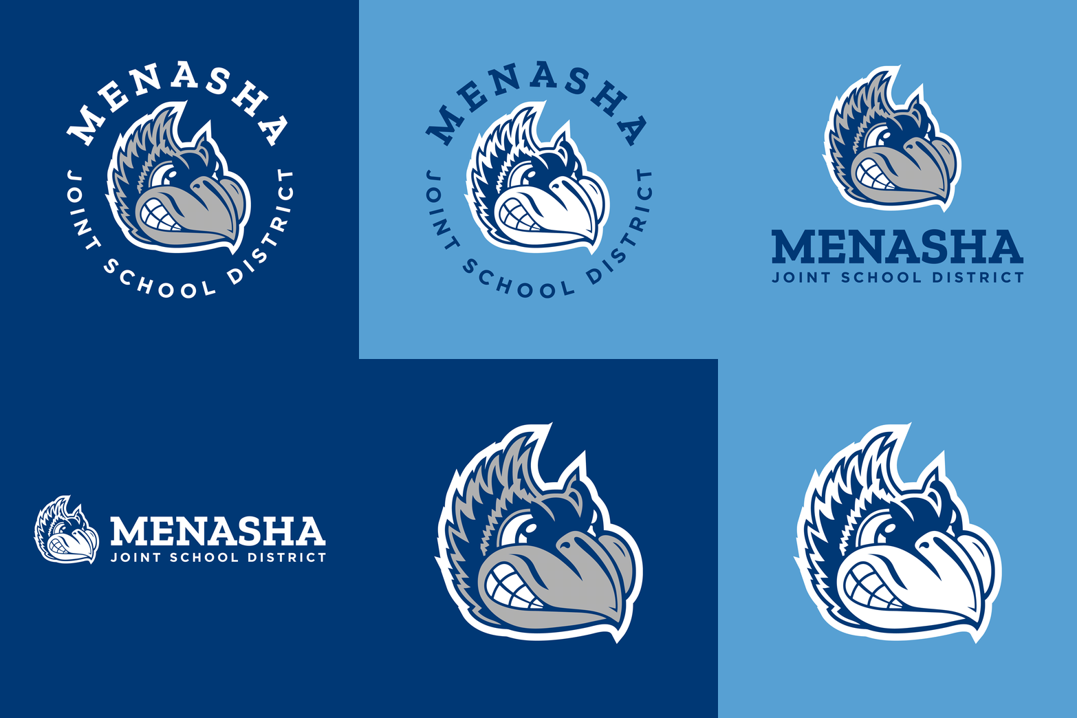
The district’s Bluejay mascot, a proud symbol of the district, had suffered from distorted and poor resolution over the years. To address this, Menasha Joint School District (MJSD) partnered with CEL to restore and modernize the look of the mascot. The process involved a subtle cleanup and simplification of the original design, along with approved variations to ensure brand consistency. Recognizing the importance of unity and the tradition, Menasha Joint School District decided to fully embraced the Bluejay as part of their central identity, replacing their outdated logo, which lacked connection to the district’s history and central legacy.

BEFORE
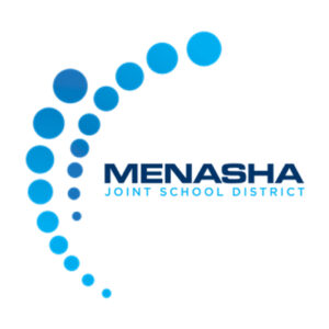
AFTER

Expanding the District’s Visual Identity
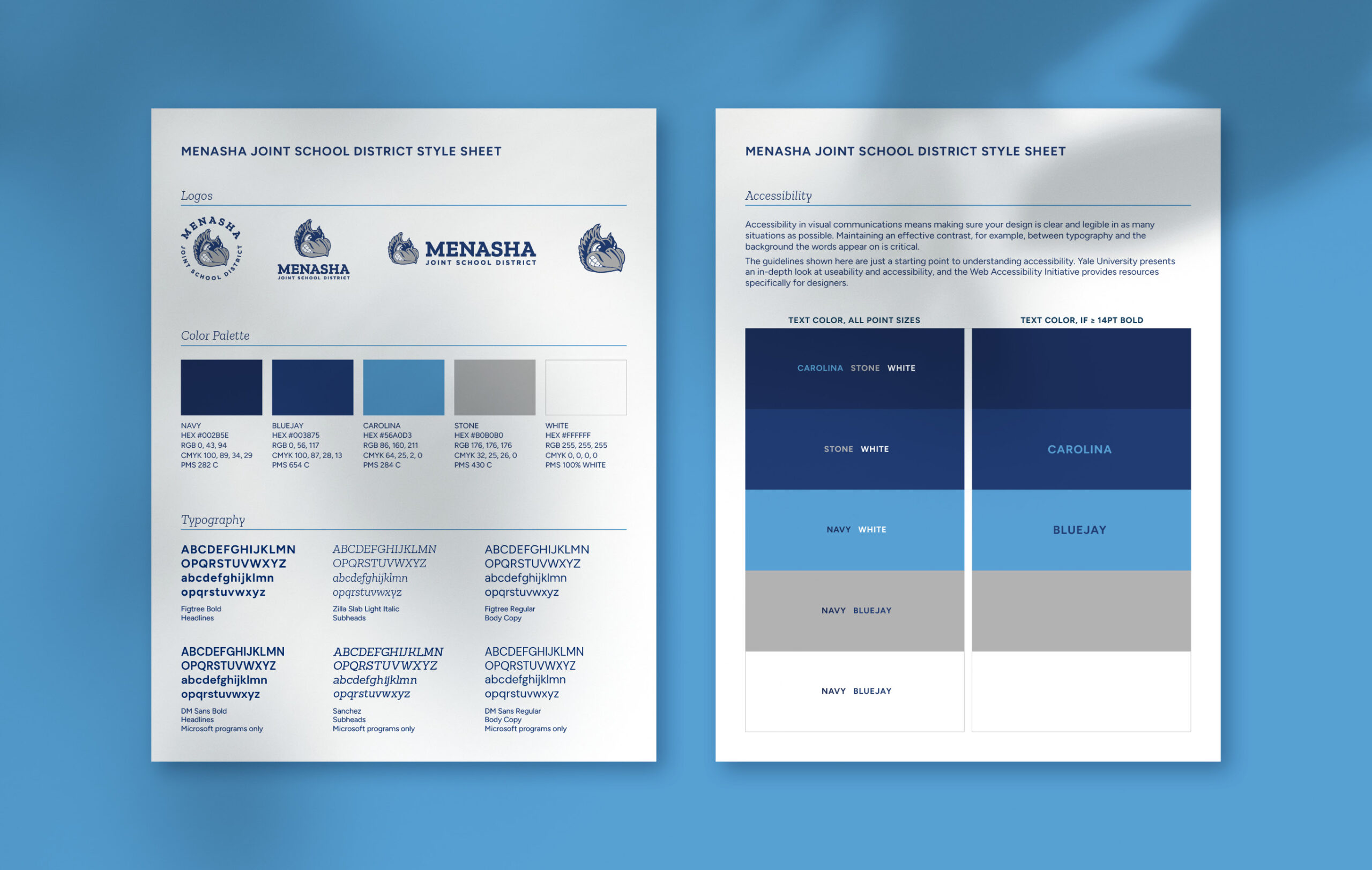
To ensure the brand remained cohesive and adaptable, we redefined and expanded the visual elements. The color palette, previously limited to blue and white, was broadened to include more vibrant complementary shades of blue. This change added flexibility while improving overall accessibility. Alongside the expanded colors, CEL modernized the district’s typography by selecting updated, Google-safe fonts. These new fonts will allow for consistent display of text across digital content and are optimized for readability and compatibility across systems and browsers. These new typefaces maintained the essence of the original style while ensuring consistency.
Collaborative Branding to Celebrate Tradition
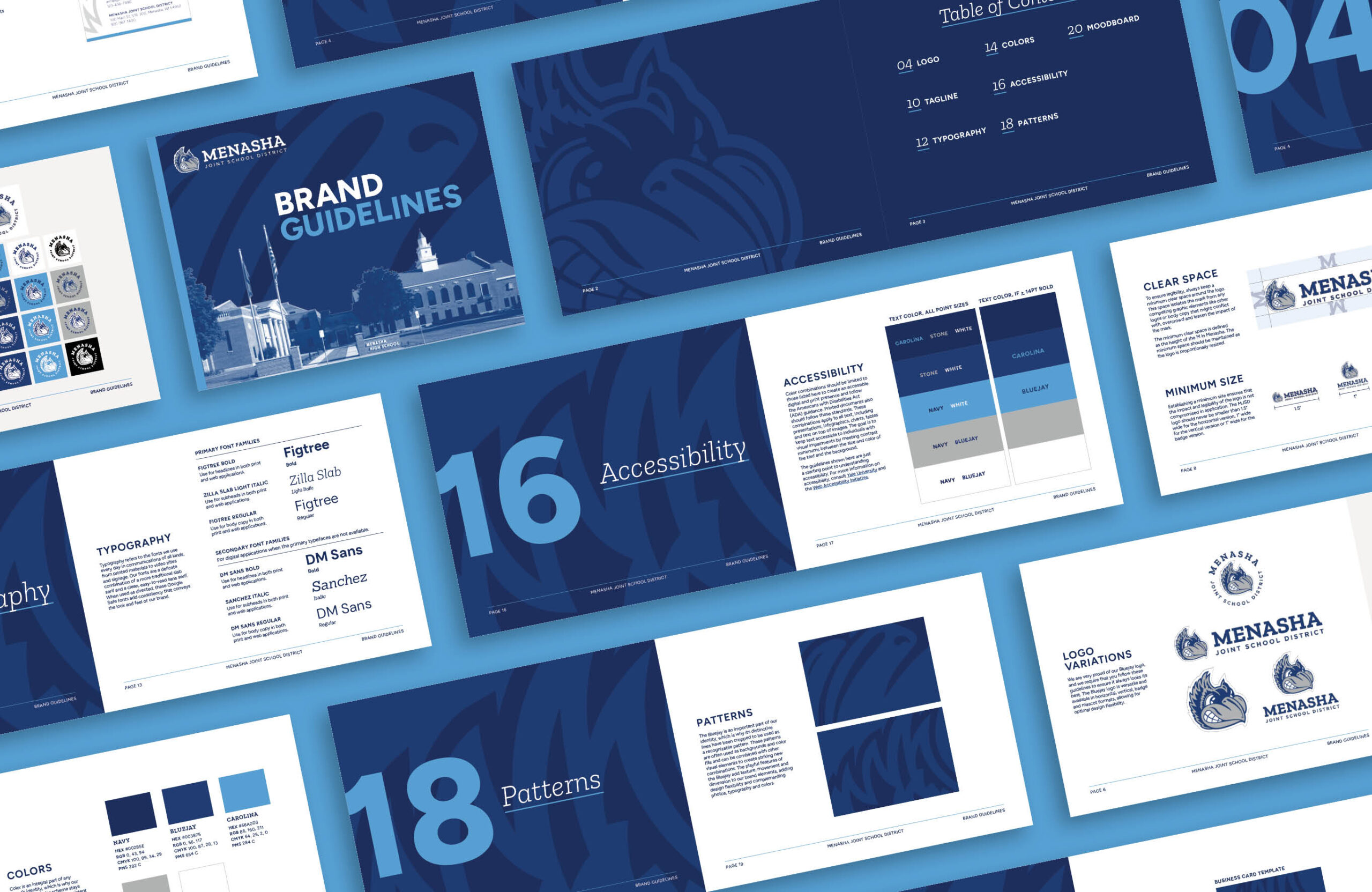
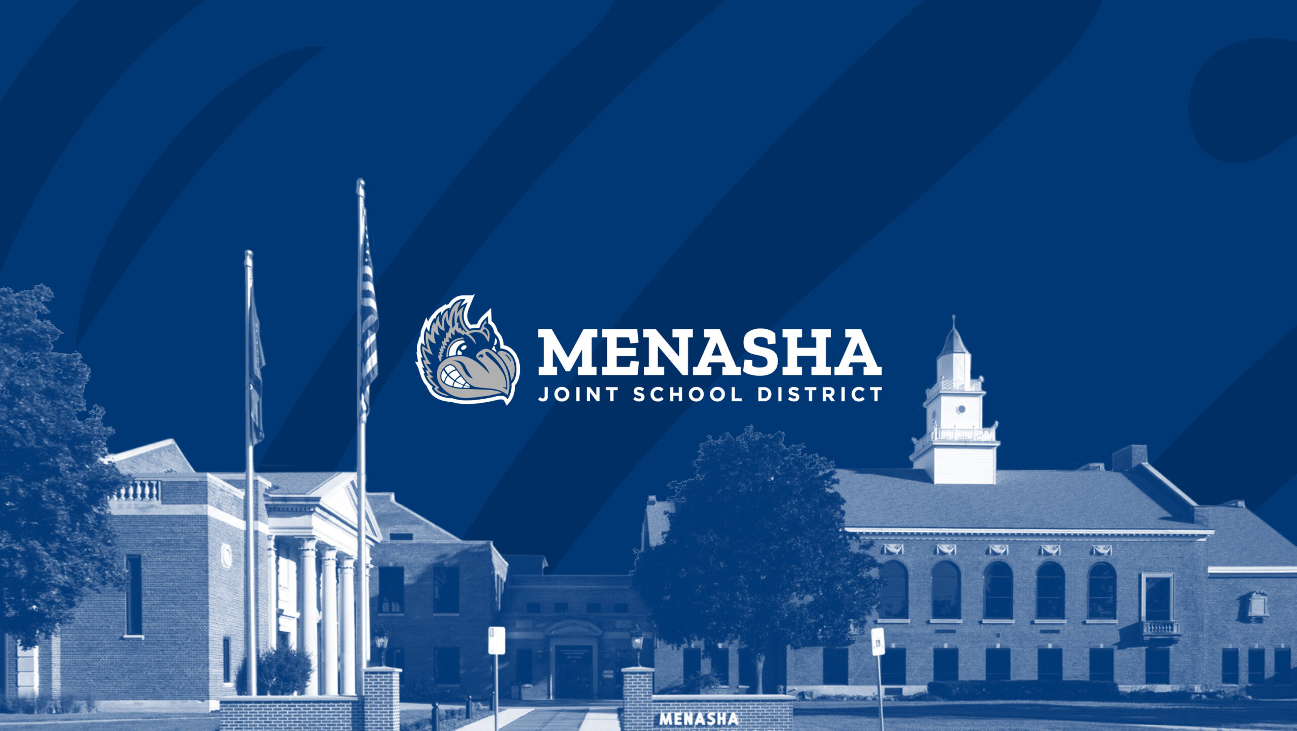
Menasha Joint School District recognized the enduring tradition and significance of the Bluejay mascot, especially compared to other branding elements at the individual school level. As a smaller district, unifying all schools under the refreshed Bluejay mascot-centric logo, rather than maintaining separate sub-brands, provided a logical solution. To further expand the brand, abstract bird feather-inspired patterns were introduced, adding a meaningful and dynamic design element that brought the Bluejay to life. While the Bluejay mascot remained the focal point, the district sought to honor its history by incorporating its iconic campus buildings into the design. CEL fulfilled this vision by creating a brochure cover that showcased the campus architecture while seamlessly integrating the updated branding and colors.
Unified Brand Assets
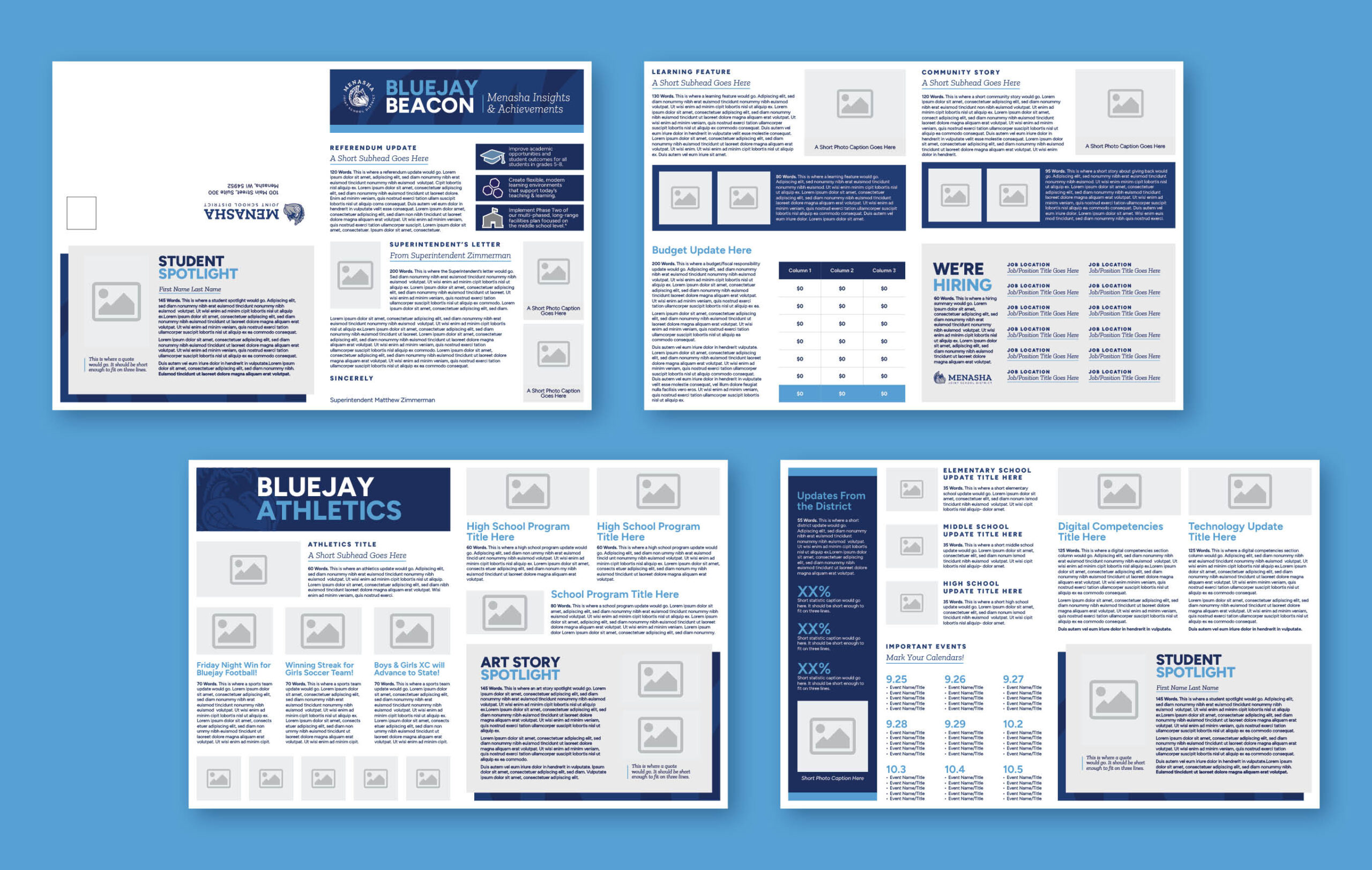
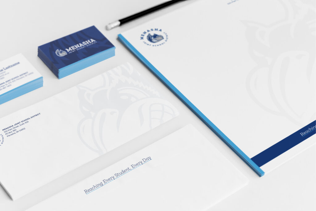
To support the refreshed brand, a full suite of design collateral was developed, equipping the district with updated communication tools including:
• Letterhead featuring a Bluejay watermark
• Business cards incorporating the subtle Bluejay feather pattern
• Slide deck templates using the new color palette and branding elements
• Brochure covers using the district’s historic campus architecture
• Brand style sheet to guide consistent application of the new visual elements




This branding project evolved from a basic mascot update into a transformative expansion of the district’s identity. By modernizing design elements while maintaining a connection to its historical roots, Menasha Joint School District has successfully created a unified, forward-thinking brand. This refreshed identity will continue to inspire pride, strengthen community connections, and support the district’s growth and communication needs in the future.
