Blog Not Found: Creating 404 Error Pages That Work
Redesigning your website’s 404 error page (which signals broken or missing content) can be a quick win for your organization. Read on for best practices and learn how to transform your 404 page into a more useful, more beautiful (yes, really!) and more professional part of your website.
Page Not Found
Preparing to launch a new website is like tackling a 2,000-piece puzzle.
First, there’s the border of the puzzle: in this case, the sitemap that you strategized over to best meet your stakeholders’ needs. There’s also how to weave text and graphics together to create a branded, seamless user experience. Accessibility considerations also account for some important pieces, and you can’t forget to think about how the site responds across multiple devices.
So that’s it then, right? Puzzle complete, checklist done, time to celebrate with a launch party?
Not quite. Amid the myriad of things to consider when preparing to go live with a sparkling new website, organizations often forget about a piece that may, unfortunately, yield more visitors than hoped for—the dreaded 404 error page.
While certainly not ideal, 404 errors affect all websites at some point, especially when the sitemap has been reconfigured and content is being redirected from older pages. Putting the same amount of thought into a 404 page as you have throughout your website can lessen users’ frustration when receiving an error and get them re-engaged with your site more quickly.
Key Components of a 404 Page
To create a positive user experience for website visitors, your 404 page should include:
- The same top-level navigation found throughout your website.
- Plain and simple language—although this doesn’t mean you can’t get creative!
- A search bar so users can quickly and easily locate the content they seek. (Pro tip: allow the search results to filter and show on the 404 page to avoid sending folks to yet another page.)
- Your organization’s brand language or tagline, mission or purpose.
To further assist information seekers, your 404 page might also include links to some of your site’s most accessed content. For example, a school might consider linking to lunch menus, transportation information or the enrollment page to elevate highly sought-after information for current and prospective families. Business or other organizations could include upcoming events, common services offered or another call-to-action based on goals.
Analyze and Adjust
As you finesse your new website in the days and weeks after launch, keep an eye on the analytics to determine the pages with the greatest number of visitors. Does it make sense to change up the links to frequently accessed content on your 404 page? You get to decide, but let the analytics help you make a thoughtful determination.
If analytics show that your site’s 404 page is getting a lot more traffic than you’d like, don’t fret! Instead, consider scheduling time on your calendar each week to check for broken links and issues with redirected content. There are many free online tools that can assist you with this task, as well as plugins for certain browsers, and a quick web search can help you find the program that best meets your needs.
404 Pages Done Right
We’ve curated a few of our favorite 404 page designs. As you browse these examples, reflect on the strategy behind each page and consider what might work for your organization.
Stillwater Area Public Schools
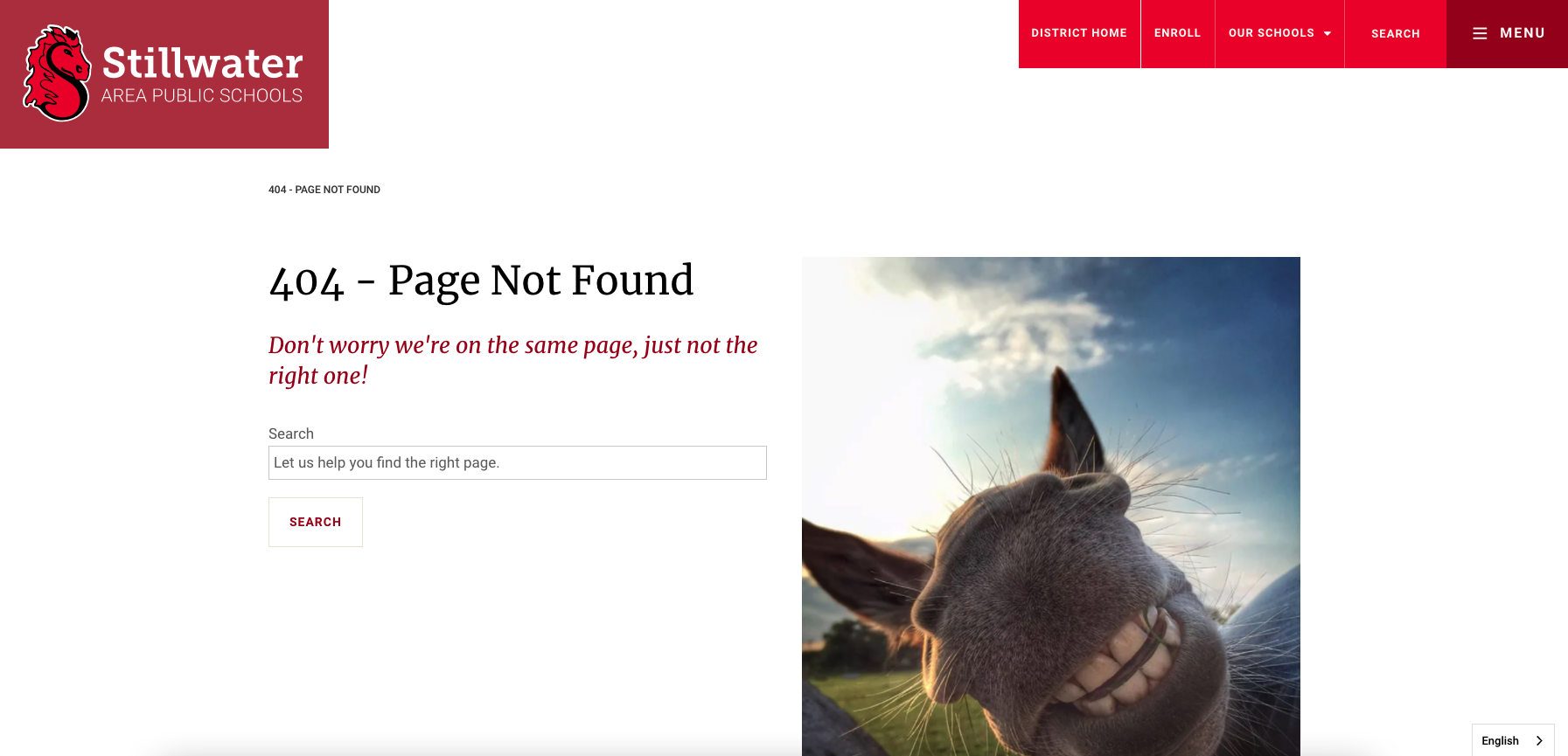
Located east of Minneapolis/St. Paul, Stillwater Area Public Schools takes a cheeky (or should we say, toothy) approach to its 404 page. The attention-grabbing photo of a smiling pony pays homage to its mascot, while the opening sentence provides a little humor. The district incorporates a search feature on this page and has the results filter here as well, providing a more streamlined user experience and a slick way to get visitors back on track.
Southdale ObGyn
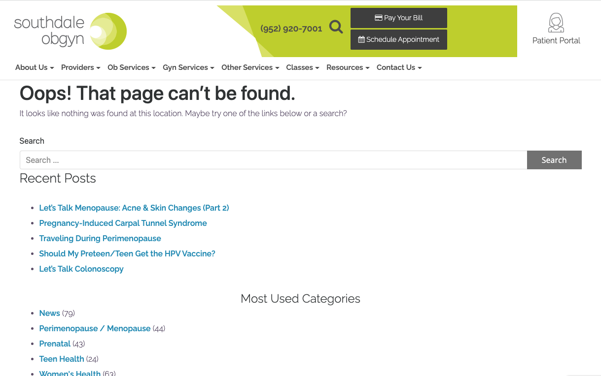
Southdale ObGyn’s 404 page really delivers. We appreciate the clean and eye-catching branding displayed prominently in the header and that this page includes the main site navigation to give visitors options for where to go next. The large search box is the featured element on this page, and a listing of recent blog posts subtly engages users and increases the reach of timely and important content.
ISD 279-Osseo Area Schools
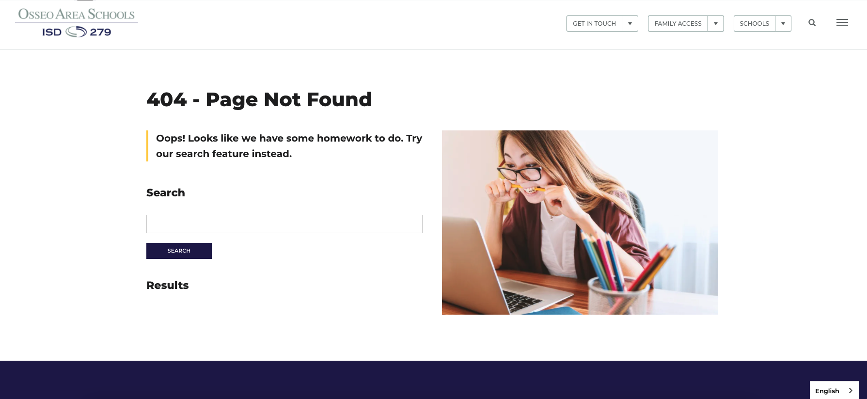
Another suburban Minnesota district, Osseo Area Schools, also grabs users’ attention with a large photo that empathizes with the frustrations of reaching this page. As a public school system, the district incorporates language about doing homework—which is a clever way to take responsibility for the missing or broken content and adds levity to the situation. Like Stillwater, Osseo Area Schools keeps users engaged on the page with a handy search feature and results that filter on the page.
Hootsuite
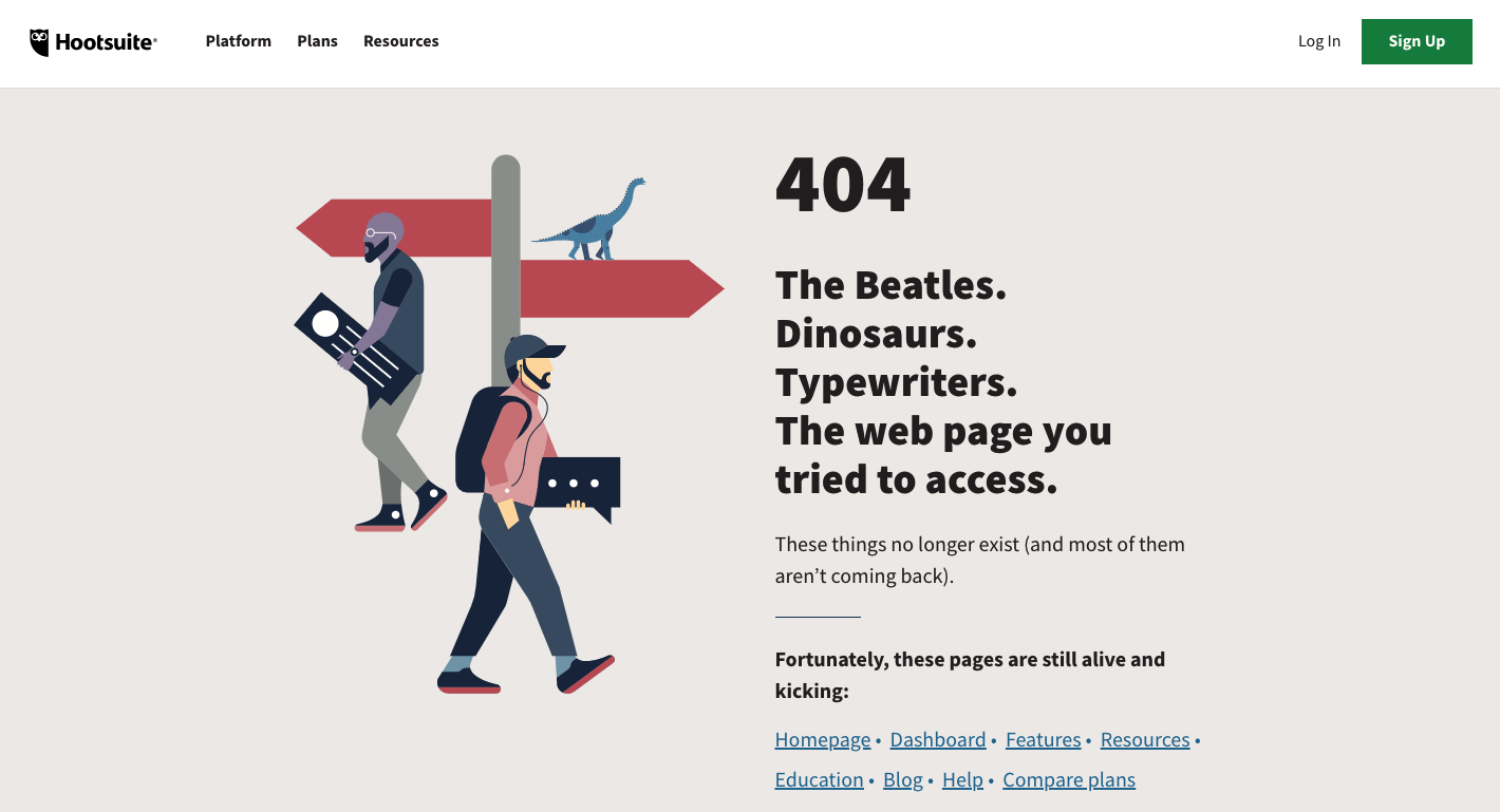
If you can’t beat ‘em, join ‘em. Social media management platform Hootsuite uses its 404 page to grab attention with references to yesteryear and, in the process, relies upon humor to take responsibility for broken or missing content on its website. Although there’s not a search function embedded on the page, links to frequently accessed content allow users to quickly re-engage with the site.
KonMari
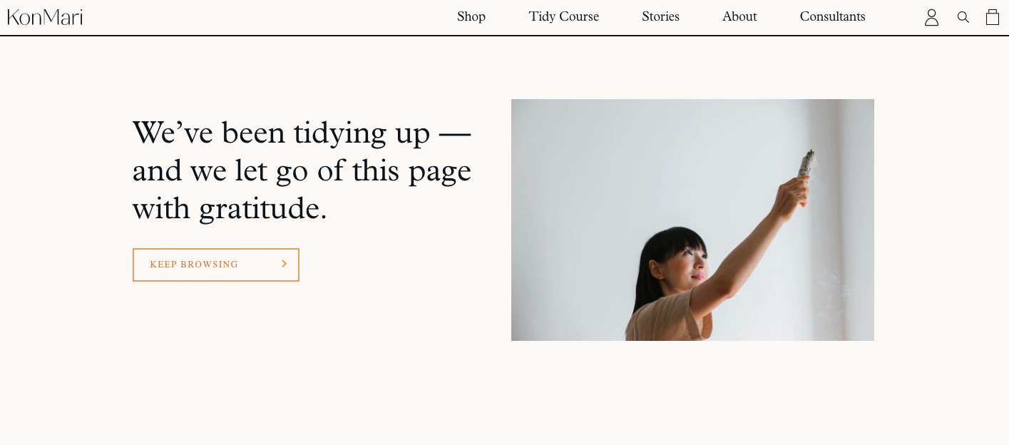
True to her brand, Marie Kondo’s KonMari website features a 404 page that’s neat, tidy and to the point. Part of her innovative tidying method is to thank items that no longer spark joy before getting rid of them—messaging that’s reinforced here. While simple, this 404 page includes the same navigation found throughout the site, a search bar in the upper right corner, and a large button that keeps users on the site by bringing them back to the homepage.
LEGO
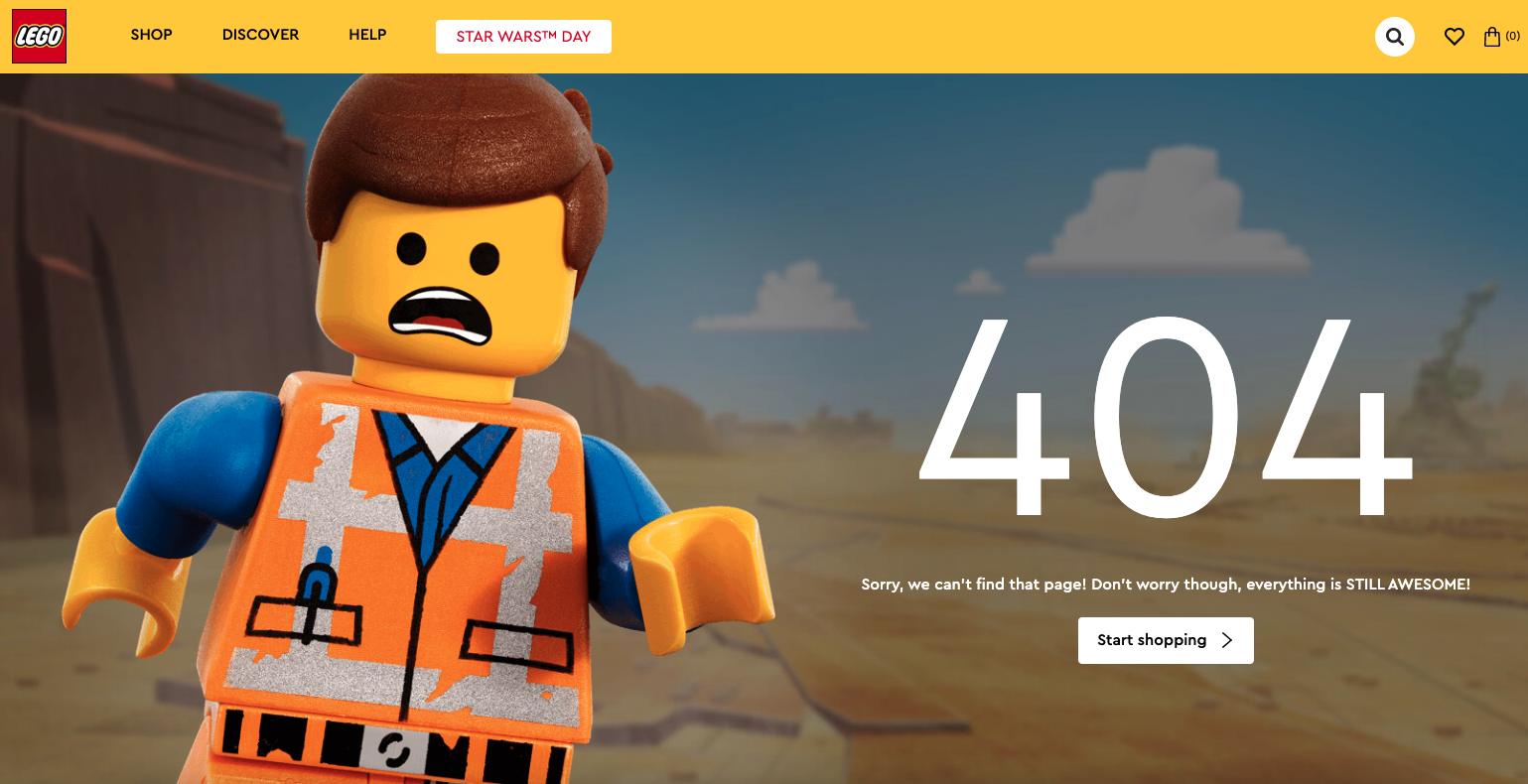
One of the world’s most recognizable brands, LEGO utilizes a 404 page that’s authentically its own. A larger-than-life character is attention-grabbing and the “everything is still awesome” messaging is on point. (You have that song stuck in your head now, don’t you?) LEGO takes advantage of an easy way to re-engage users with a shopping call to action and, like the other examples listed here, includes the main site navigation so web visitors can explore other sections of interest.
Your Next Steps
Putting thought into your 404 page should be an important part of your website strategy. Use this page as an opportunity to humanize your organization’s brand, take ownership for broken or missing content, and give users a quick way to get back on track. What may seem like just another piece of the puzzle to you could be a game-changer for your stakeholders.
If you’re ready to level up your site’s 404 page, contact us today. We love a good puzzle!
Published on: May 13, 2022